Select work from our 30+ clients
Clients
30+
Trusted by over 30 ambitious teams, from startups to global brands.
Industries
6
From fintech to healthcare, we bring cross–industry insight to every project.
Services
8
UX audits right through to full apps — we design, build, and optimise full digital experiences.
Stars
5
Rated 5 stars from nearly every client. Don't take our word for it, read our Clutch ↗ reviews.
+44 (0) 7862 024 527

"Everyone on the Spinning Fox team is truly dedicated to their craft and passionate about user-centric design. They're an absolute pleasure to work with."
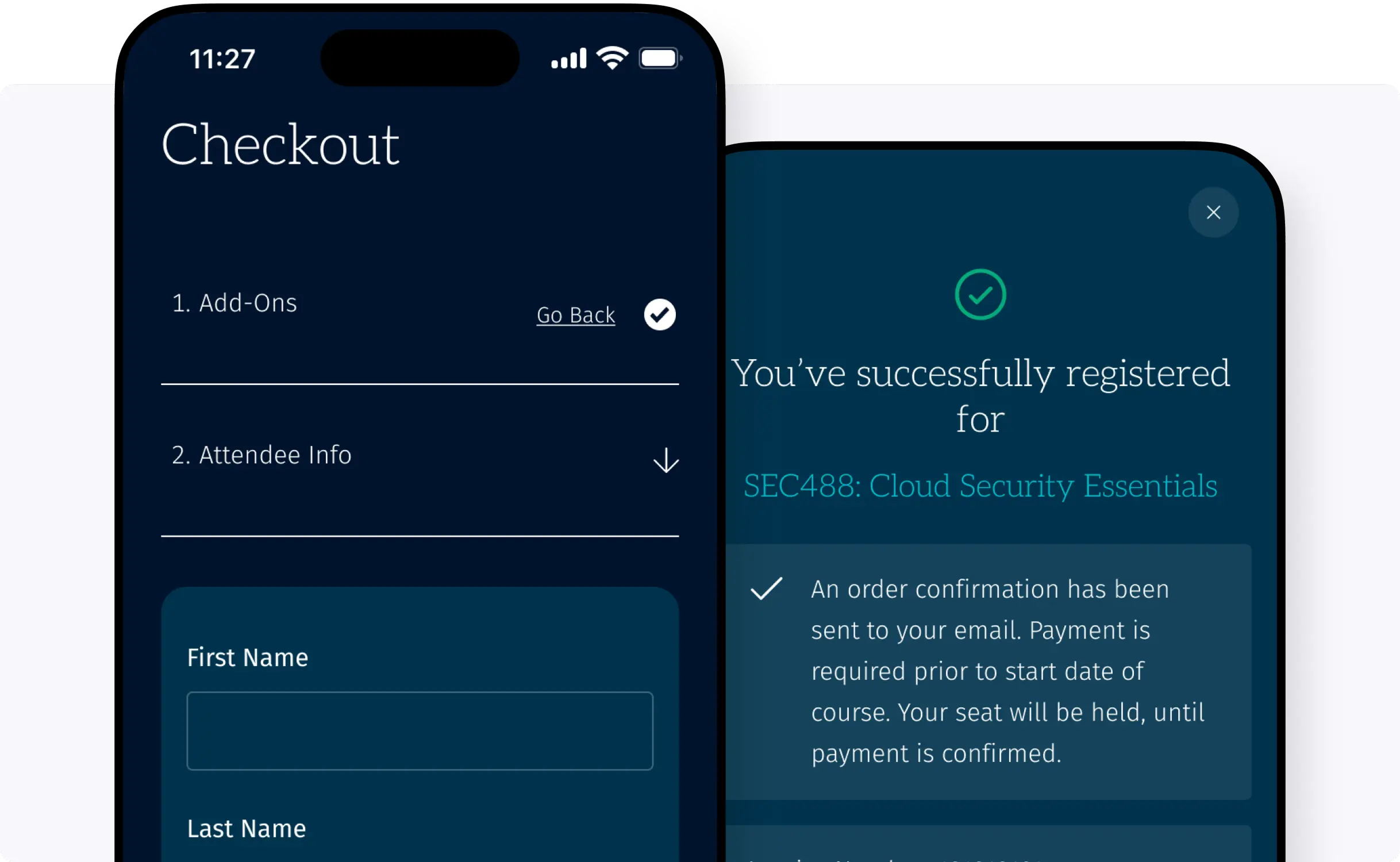
SANS Institute