Tapestry
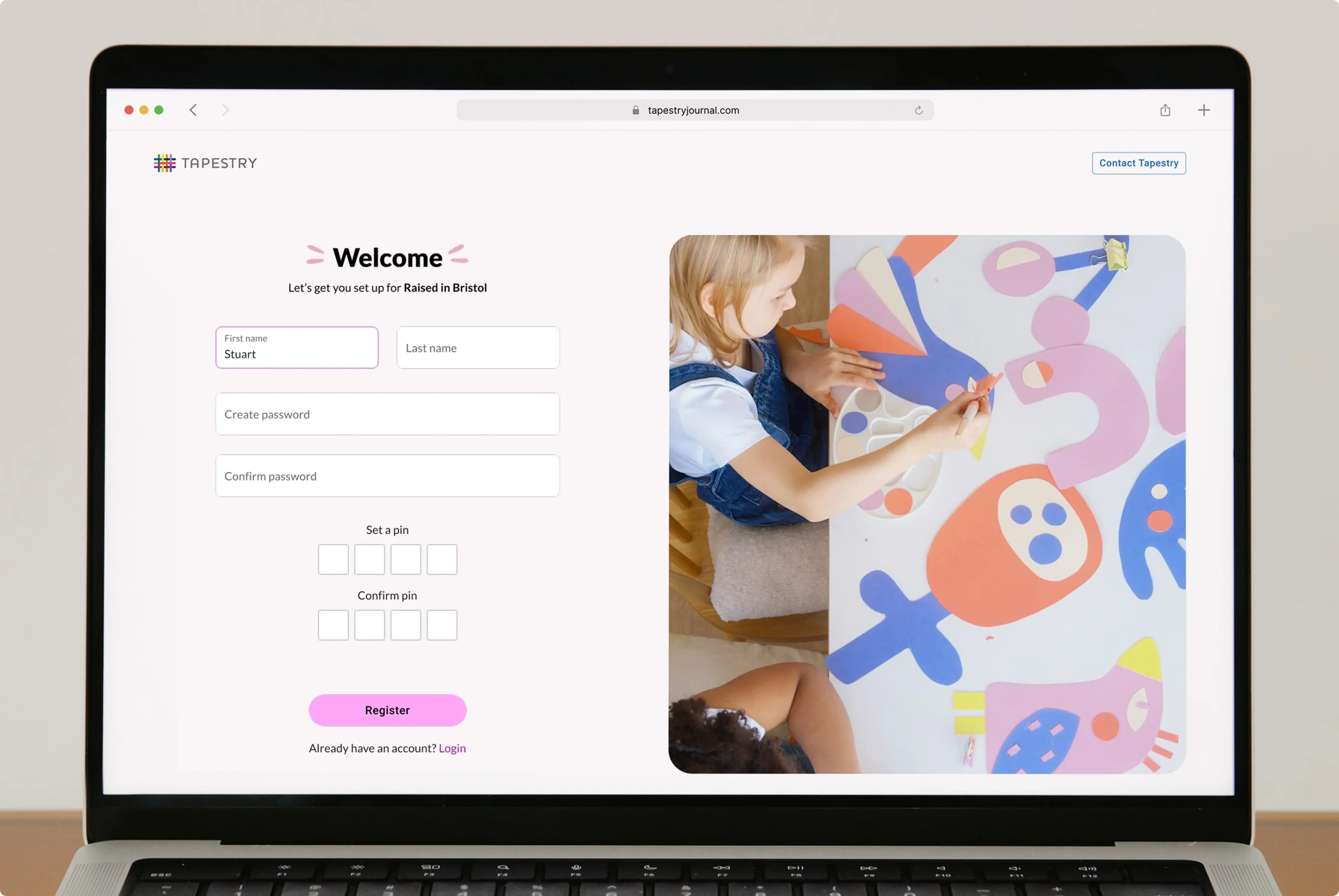
A new engaging and friendly UI, wonderfully simplified.
Client
Tapestry
Problem area
Increasing conversion rates and business revenue with UX.
Services provided
UX audit, user interviews, user flows, wireframes, UI kit and UI design.
Tapestry, a widely–used platform in the education sector, needed to overhaul its onboarding process to stay competitive and improve long–term adoption. Their setup experience was confusing — especially for admin users — resulting in user drop–off, a flood of support tickets, and missed growth opportunities.
We partnered with their team to redesign the onboarding journey around a flexible, task–based checklist that supported real user behaviour. The outcome was a smoother experience, greater confidence from day one, and a dramatic increase in user activation. Since launch, over 1,398 new schools have onboarded — with zero support tickets related to the new process.
Client quote, weeks after launch
"Only just yesterday a customer that was about to leave us for a competitor is now reconsidering, saying: we're speechless, we love what you've done, it's absolutely amazing."
Lauren Foley, Product Development Manager, Tapestry
The old UI's were complex, hard to understand, and converted poorly.
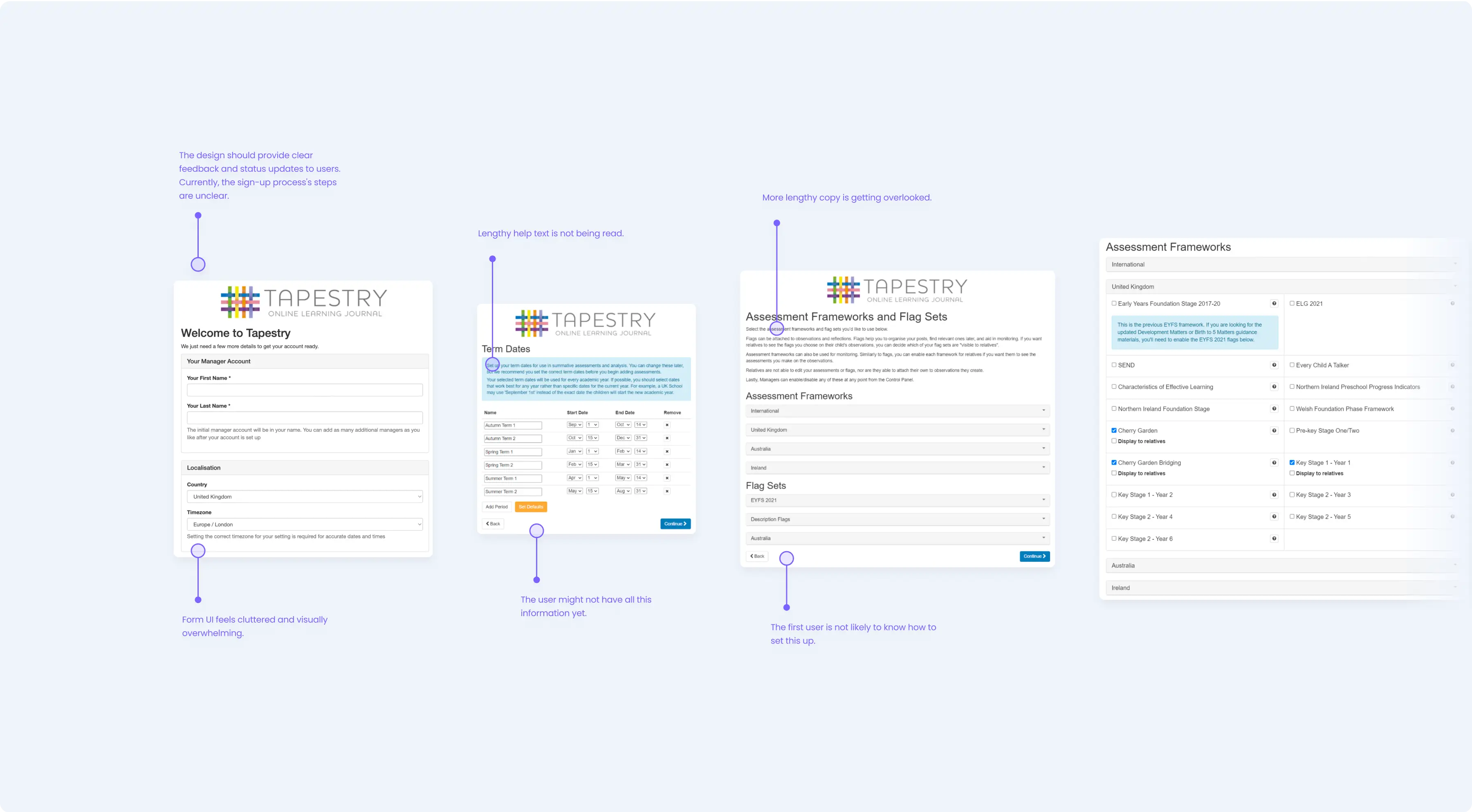
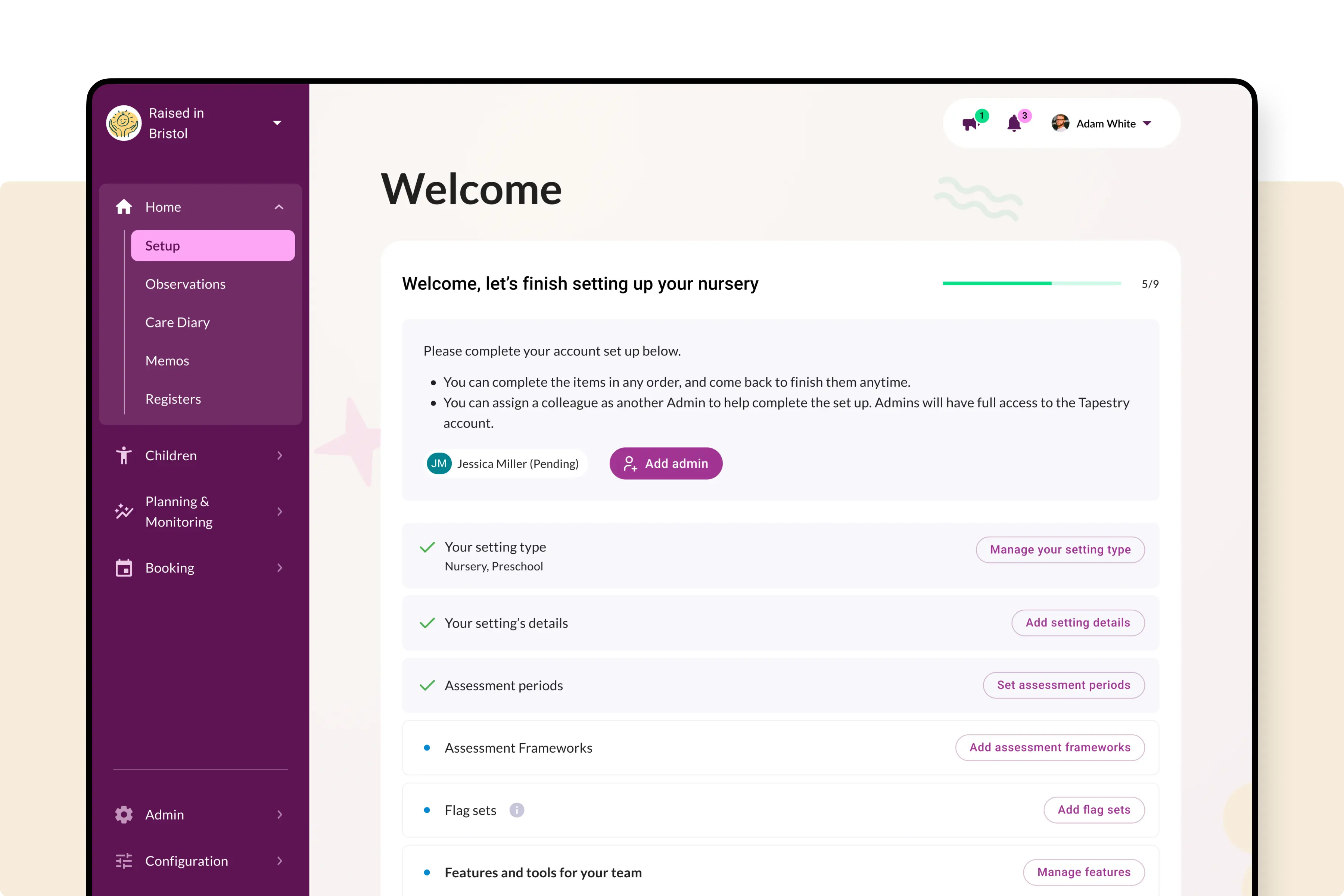
The status quo: a confusing first impression was slowing growth
Tapestry's previous onboarding was fragmented and unclear, particularly for administrators who needed to set up core platform features. This led to setup delays, high volumes of support requests, and a lack of user confidence. The experience became a barrier to adoption, especially in a competitive EdTech space with aggressive venture–funded alternatives gaining ground.
Applying modern UI design principles made a huge difference.
Making the process clearer for time-poor admin users.
The challenge: simplify without disruption, and improve conversion
The brief was to streamline onboarding without affecting existing functionality or confusing long–time users. We needed to reduce friction, modernise the UI, and empower users with varied technical experience — without breaking compatibility with the existing MUI framework. The goal was not just clarity, but higher activation and business performance through better UX.
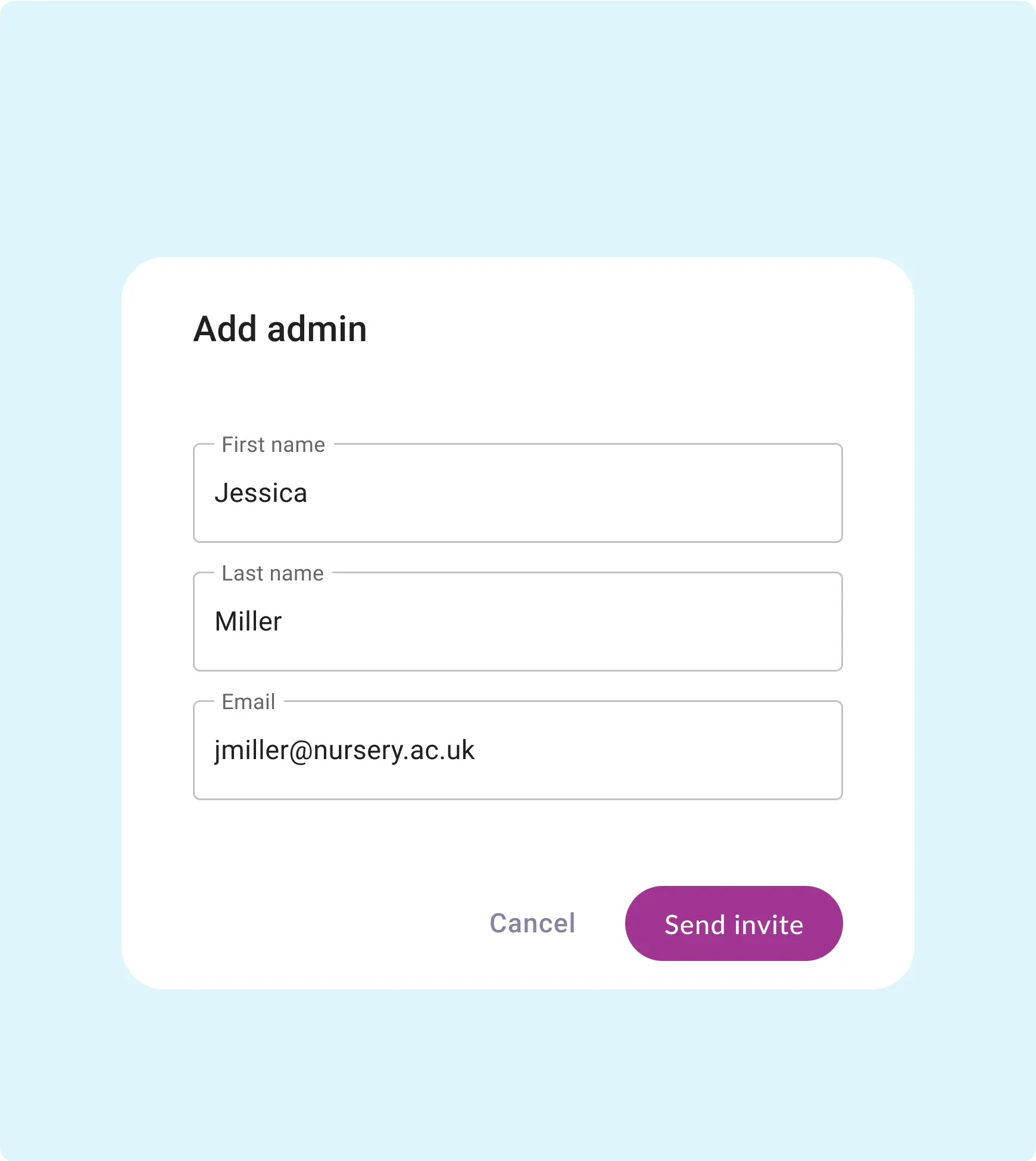
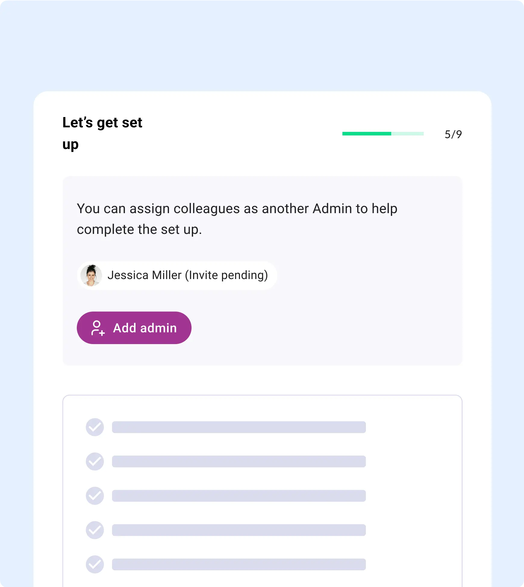
A simple checklist concept has completely removed support queries.
Our approach: checklist–driven design with measurable impact
We began with a UX audit, user interviews, and feedback from internal teams to pinpoint the root issues. We then designed a non–linear onboarding checklist users could complete in any order — making it collaborative, intuitive, and resilient to blockers. Key flows were refined rather than rebuilt, balancing familiarity with meaningful improvements. Moderated user testing confirmed the changes worked.
ROI
92.7%
Checklist completion rate
ROI
83%
Found the new design intuitive
Feedback on the simplified onboarding experience has been overwhelmingly positive.
The outcome: clearer onboarding, faster adoption, higher ROI
The new experience simplified setup, improved confidence, and enabled collaborative onboarding across teams. Since launch, 1,398 new schools have successfully onboarded, with zero support tickets for the new process — a powerful signal of clarity and effectiveness.
Client quote
"Spinning Fox's redesign empowered our users — it's easier, more intuitive, and beautifully executed."
Lauren Foley, Product Development Manager, Tapestry
Client quote
"The end result looks absolutely amazing — we're so thrilled at the prospect of letting people see the 'new' Tapestry."
Steve Edwards, Founder, Tapestry
+44 (0) 7862 024 527

"Everyone on the Spinning Fox team is truly dedicated to their craft and passionate about user-centric design. They're an absolute pleasure to work with."
SANS Institute

