SANS Institute
Making a checkout which processes millions of dollars highly functional.
Client
SANS Institute
Problem area
Increasing conversion rates and business revenue with UX.
Services provided
Stakeholder interviews, usability testing, UX audit, e-commerce best practice research, user journeys, ideation, UI design, and building interactive prototypes.
SANS Institute, a global leader in cyber security training, faced a common yet costly problem: their checkout flow wasn't keeping up with modern e–commerce expectations. Confusing steps, inconsistent UI patterns, and unnecessary friction meant users were taking too long to complete transactions — or abandoning them altogether.
We worked closely with the SANS team to redesign their e–commerce journey within the constraints of their Salesforce–based infrastructure. The result: a faster, clearer checkout experience aligned with user behaviour — reducing confusion, boosting confidence, and paving the way for higher conversions.
The key, we found, was to simplify the process for users as much as possible.
The status quo: a slow, frustrating checkout costing revenue
SANS's previous checkout experience was long–winded, inconsistent, and failed to support simple user needs — like adding multiple courses to a cart or clearly applying a voucher. Users frequently abandoned purchases or contacted support, with registration sometimes taking more than 30 minutes to complete. Critical calls–to–action were hard to find, and flow disruptions made high–value transactions feel untrustworthy — damaging brand perception and sales.
Team insight
"SANS are a client we've worked with for many years and we know them well, so it was immediately obvious to us that their checkout process didn't align with the high quality of their product."
James, Managing Director

Finding innovative ways to include upsells.
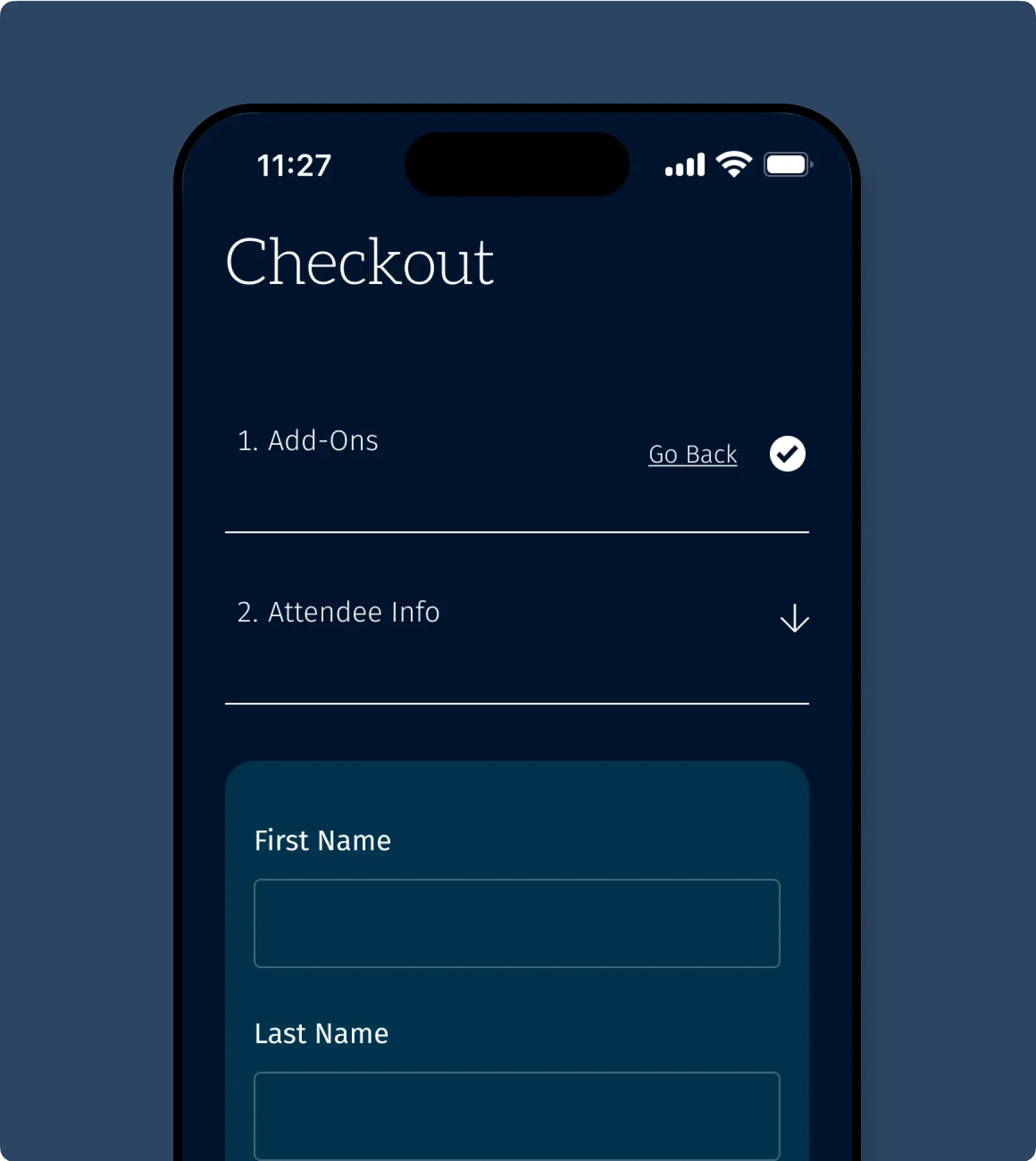
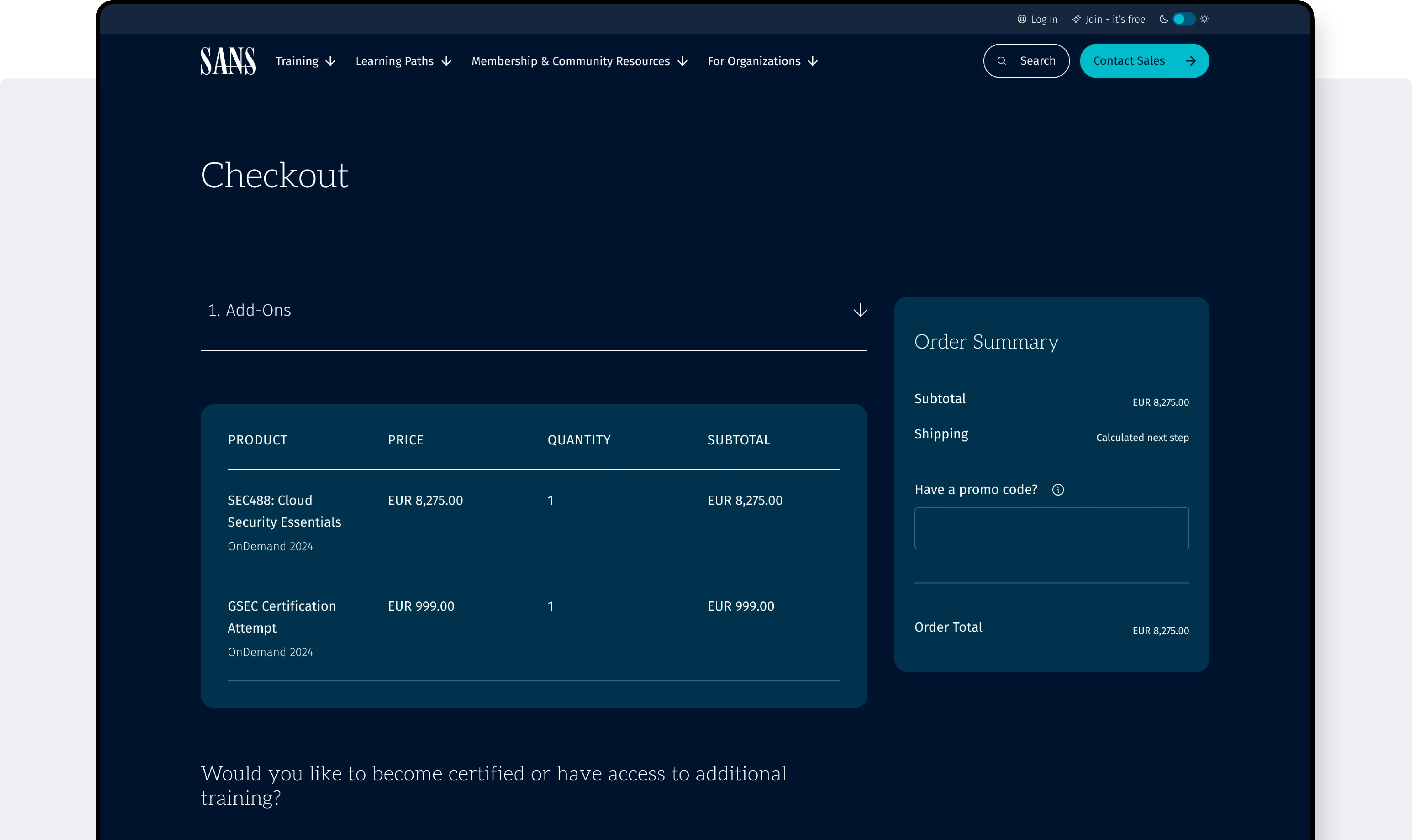
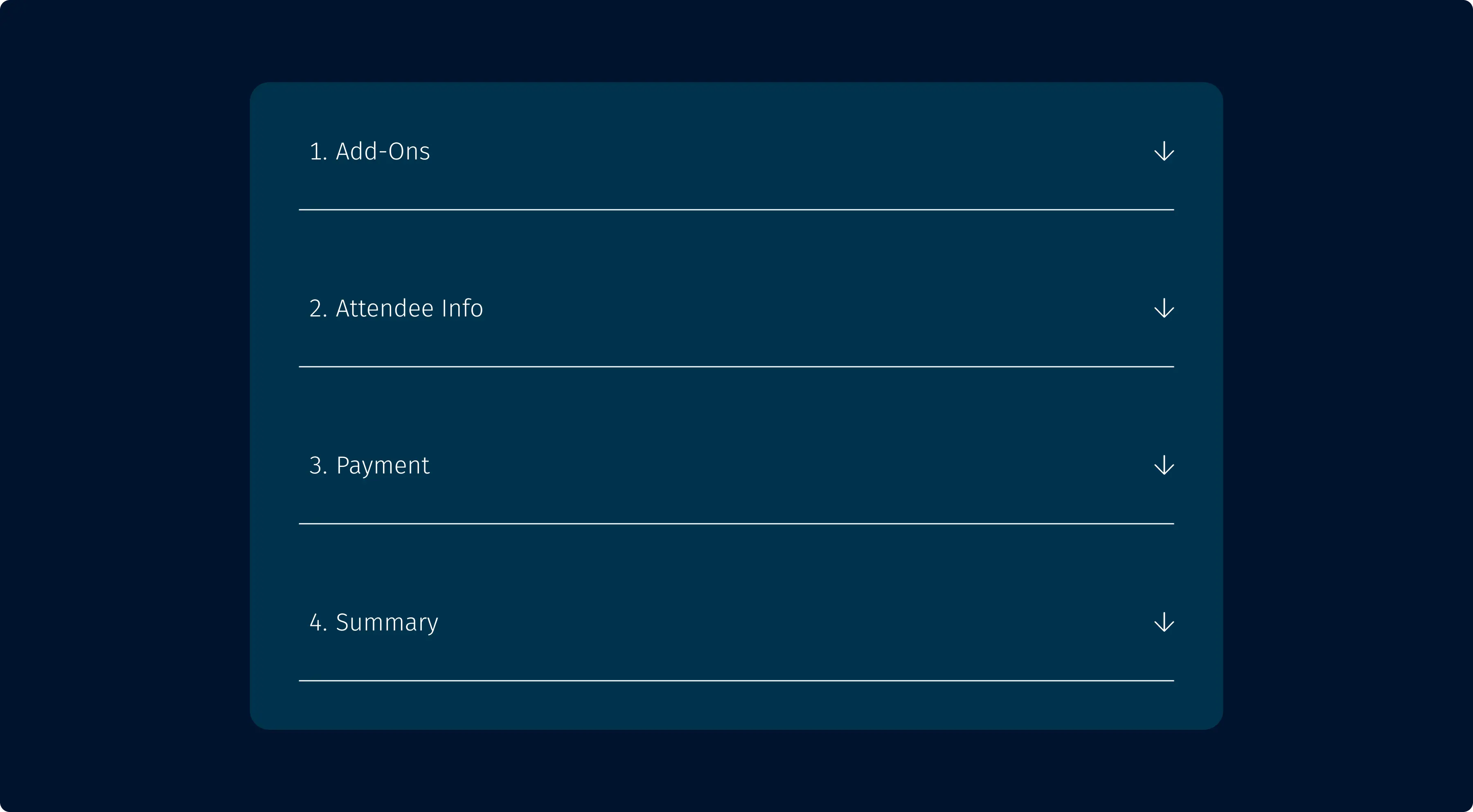
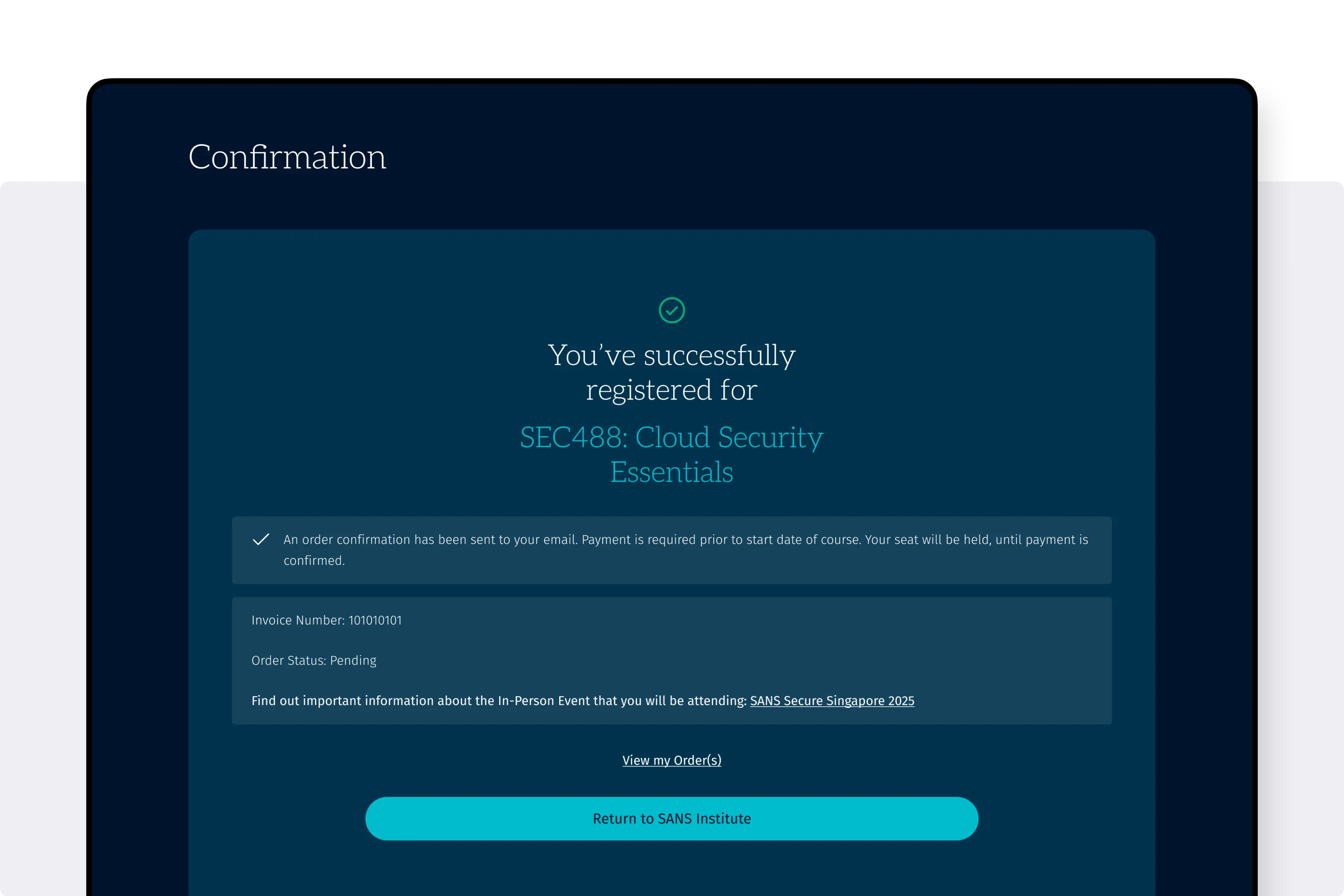
A clear and simple checklist for a complex process.
The challenge: improve UX within tight technical limits
The project had to deliver a significantly improved experience without overhauling the Salesforce–driven tech stack. That meant working within existing limitations (such as no multi–item support), navigating a complex product structure, and gaining consensus from multiple internal teams. Our goal: reduce drop–off, simplify steps, and modernise the journey — while keeping changes technically feasible and impactful.
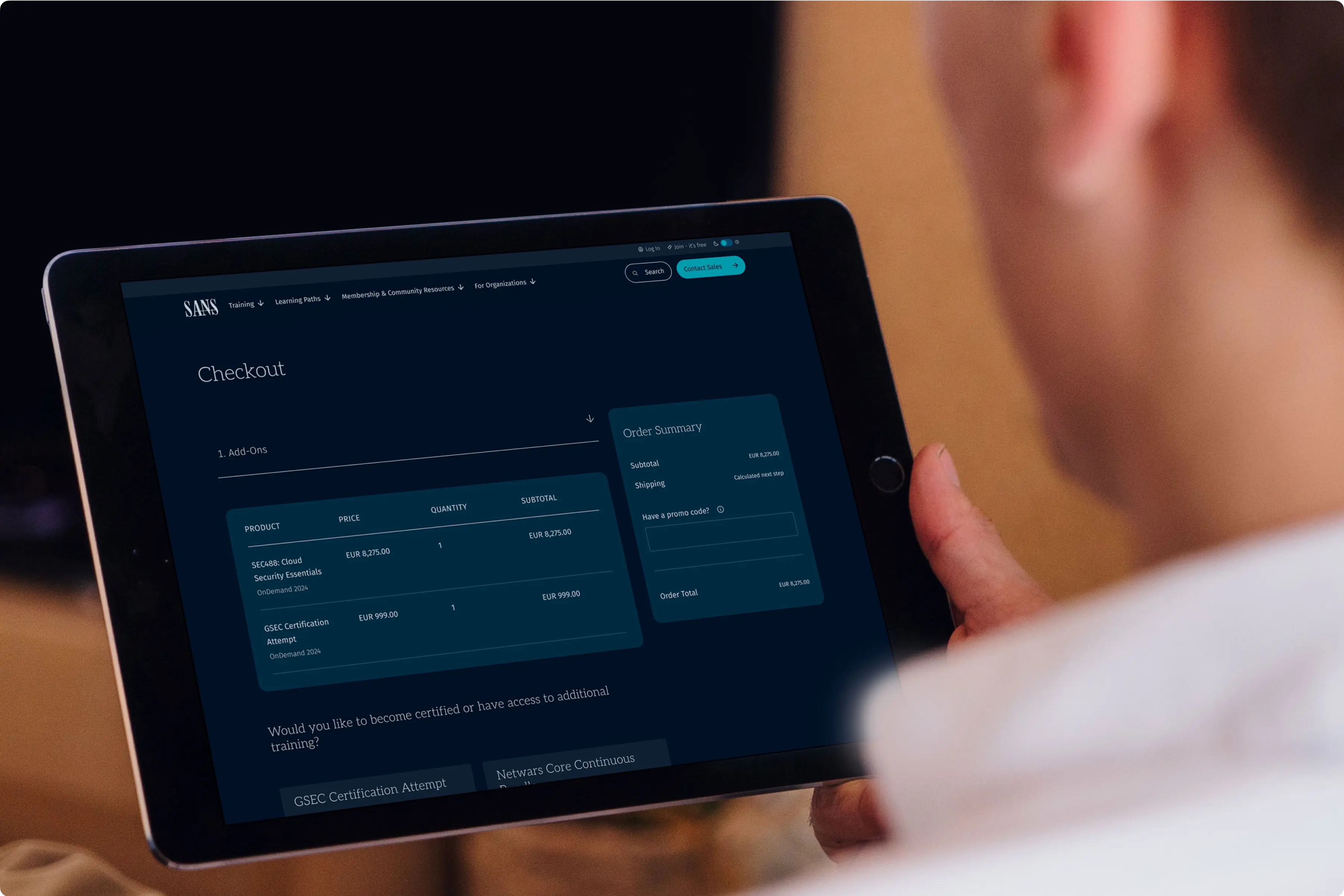
The new UI will be used by thousands of cyber security professionals across the world.
Our approach: behaviour–driven design, e–commerce best practice
We began with usability testing, stakeholder interviews, and analytics from HotJar to identify core pain points — like users backtracking mid–checkout, or struggling with voucher fields. We then ran a full UX audit, mapped pain points, and ideated new flows inspired by e–commerce best practice. Working closely with stakeholders, we prototyped improvements and validated them through user testing — refining the UI around real–world usage and technical feasibility.
A new UI which builds trust with users.
The outcome: a smarter, faster checkout that builds trust
We delivered a redesigned checkout that was clearer, faster, and better aligned with user expectations. Key changes included a modernised UI, consistent CTA placement, clearer voucher messaging, and better upsell integration. The result was a more confident user journey, reduced friction, and a significantly improved experience that better matches the quality of SAN's offering. Post–launch metrics on conversion and support reduction are in progress, but early usability testing confirmed major improvements in clarity and flow.
+44 (0) 7862 024 527

"Everyone on the Spinning Fox team is truly dedicated to their craft and passionate about user-centric design. They're an absolute pleasure to work with."
SANS Institute

