
Empowering Product Teams: A Step-by-Step Guide to Crafting Accessible Products
A look at how to craft accessible digital products.
Aug 1, 2023
-
5
min read

We can create design assets that are fully annotated for accessibility to hand over to development teams, to implement code that works for assistive technologies. A key resource to help your team with this is the Figma A11Y toolkit, containing a set of components to correctly annotate each part of your design. On a recent project, I worked alongside an accessibility expert who is also a screenreader user. We went through each screen and used the toolkit to annotate the screens for assistive technologies, and made notes to describe the expected behaviour of the screen reader across each page. As we went through I learned firsthand best practices on why each one of these steps is so important in providing a consistent experience to those who are visually impaired. We worked with the development regularly to ensure that the team were aligned in terms of implementation. As a result of following these steps, when it came to the first round of accessibility testing with a screen reader, the development team had built almost a fully accessible product on their first attempt. I want to share an overview with you using practical examples and tips that you can apply to your own project, to streamline this process for your team and efficiently build out inclusive products.
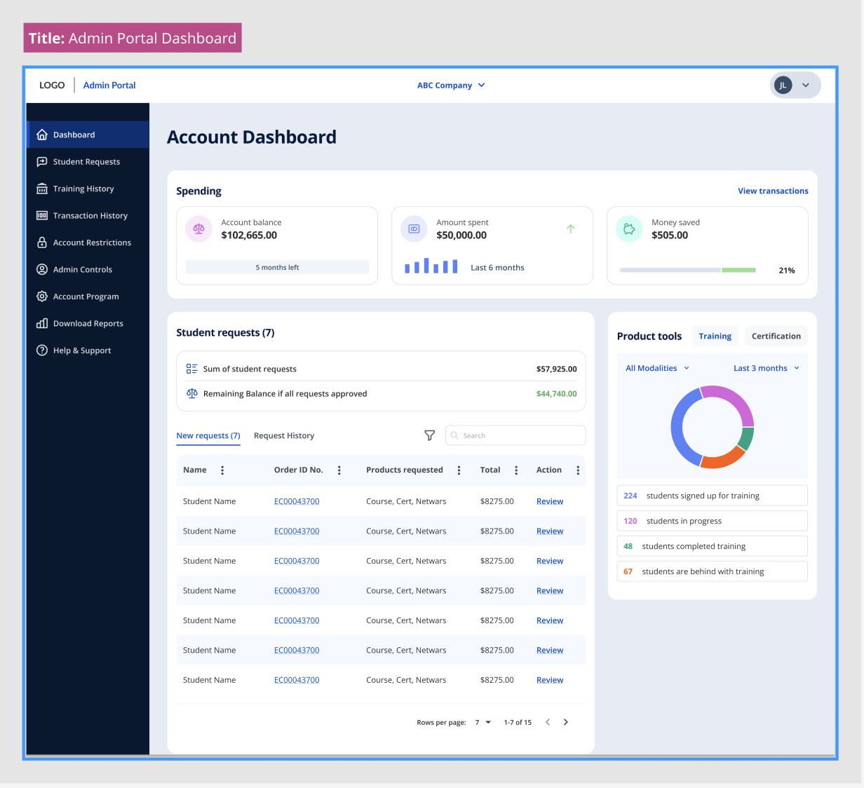
Annotating page titles:
Important because: Page titles help users understand the purpose and context of a webpage, helping those using a screen reader to know what to expect.
- Give every page of the site a title. For example, logged-out views, logged-in views, when forms are submitted, and when there are errors.
- Use descriptive titles that are unique and accurately represent the content on the page.
Tip: Page titles should have a consistent structure or pattern across a site to avoid confusion
Headings:
Important because: Headings describe the hierarchy of the content, giving structure to the page. This makes the page more scannable for those using assistive technologies as they can navigate from heading to heading.
- Document the Heading 1 (H1):Each page should have one H1 that describes the content that follows
- Determine the hierarchy:The headings are structured in order of hierarchy on the page. For example, there may be H2’S as a secondary level heading and an H2 may have an H3 within it. Typically a page would not use more than H1 to H3.
Tip: Don’t choose heading levels based on their appearance in the design system. They should always be chosen based on the hierarchy of the screen, regardless of their font size and weight.

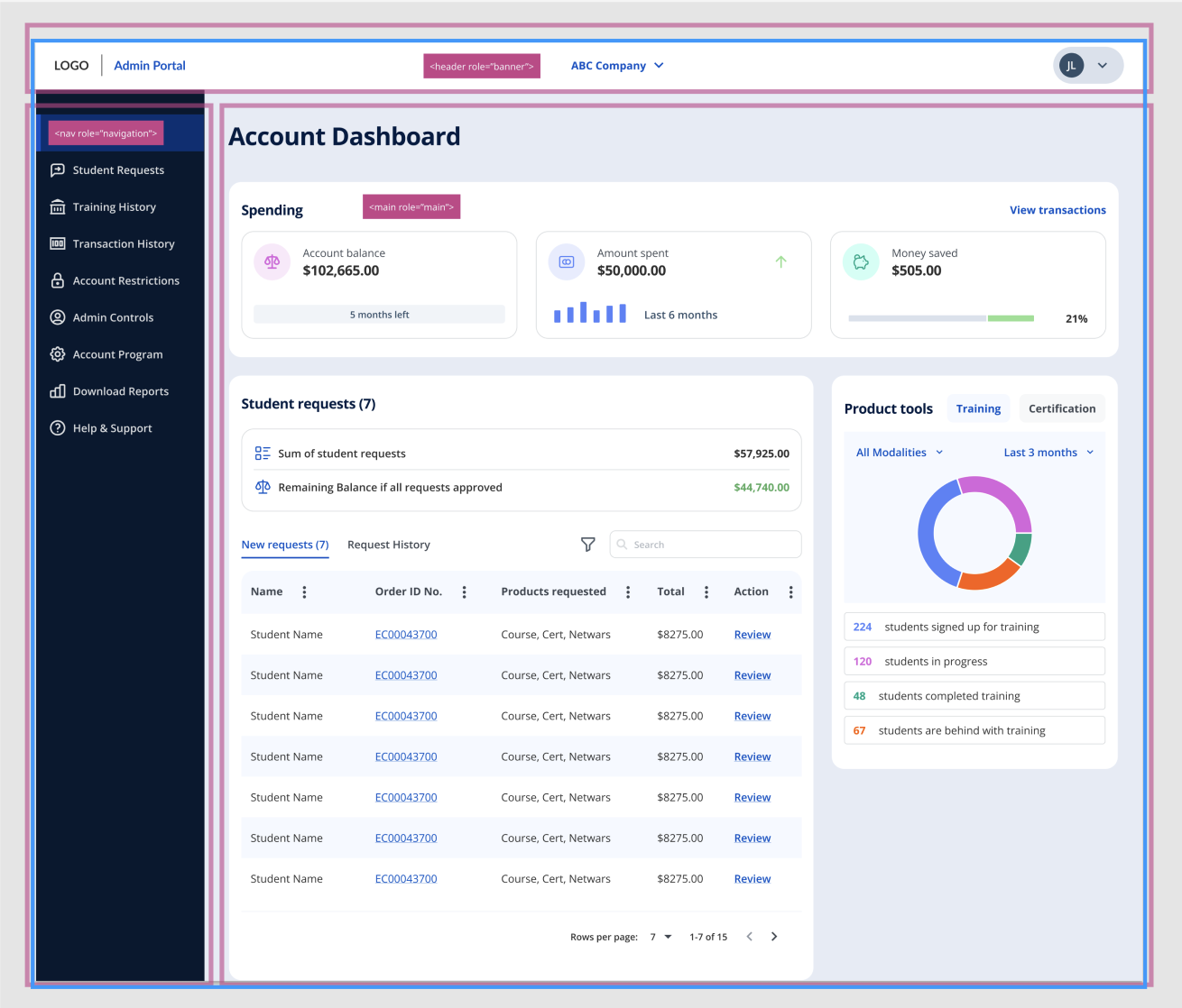
Landmarks
Important because: Landmarks help individuals using assistive technologies to create a mental map to navigate and understand the structure of a webpage. They are used less than headings and define significant page areas. At a minimum, there is usually a landmark for the primary navigation (the top left logo), secondary navigation, main content, and the page footer.
- Understand the different page Landmarks:First of all, understand the various ARIA landmarks. Each landmark has a specific purpose and usage, which helps organize the page content.
- Identify the landmark areas on the screen:Break the page down into areas that correspond to each type of landmark. Look for existing elements that match the purpose of each landmark, for example, menus, headers or footers.
- Assign roles based on the type of content that is in the area:Once you have identified the landmark elements, add the appropriate ARIA roles and attributes to them. For example, for a landmark representing the page header, you can add role=”banner”. For the main content section, you can add role=”main”.
Tip: We might also make an H1 a landmark or key pieces of functionality can be landmarks. If a table is included in the design, this may be a landmark. For example, on the Twitter website the option to write a Tweet is considered a landmark as it is a key piece of functionality.
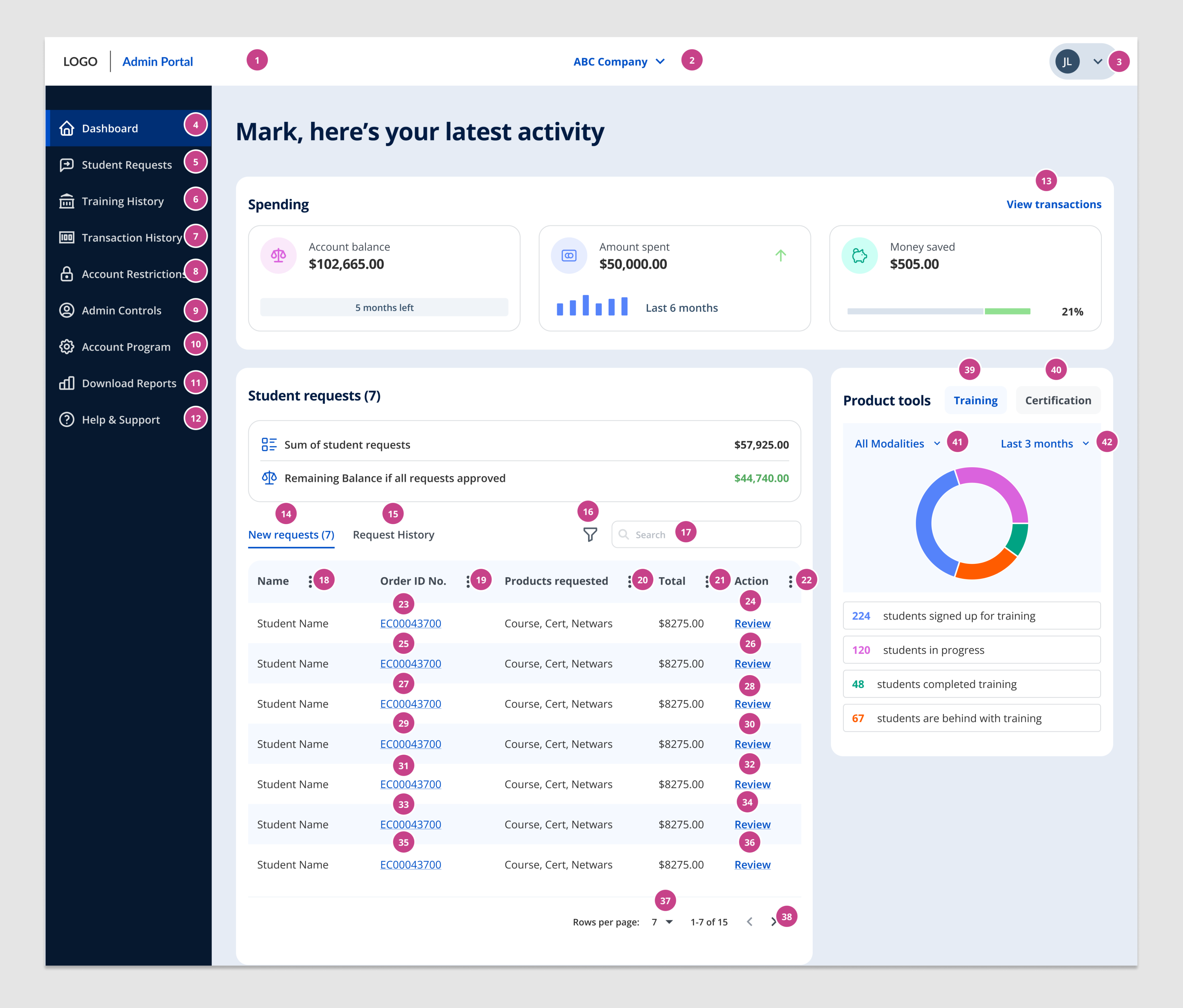
Focus Order:
Important because: Users of assistive technologies can navigate by tabbing through all of the interactive elements on a page. If the order is unintuitive it can be confusing for the user. The focus order should allow the user to tab through the content in the order we want them to absorb it. For example, tabbing through the primary navigation, secondary navigation, and then into the main content.
- Identify all of the interactive elements on your screen:Look at your design and identify the interactive elements such as links, buttons, form fields, and any other clickable component.
- Define your focus order:Determine a logical order that you would want the interactive elements to be focused on. This should start from the top left of the page and follow a natural flow of the pages content from left to right, top to bottom.
Tip: Focus order and tabs are used for interactive content only.
Non-Text Alternatives:
Important because: Those who are visually impaired should have the equivalent experience of a sighted user. If we are using something visual to convey a meaning, such as an image or graph, the screen reader should read out the meaning of the element presented visually otherwise it is unusable and a key piece of information could be missed.
- Review your design:Identify all the images and visual elements that require alternative text on your webpage. This includes photos, illustrations, logos, icons, infographics, and any other non-textual elements that convey information or serve a decorative purpose.
- Understand Context and Purpose:Consider the context and purpose of each image or visual element. Alternative text should convey the same information or serve the same function as the visual element it replaces. Determine if the element is informative, decorative, or functional, as this will influence the content of the alternative text.
- Write Descriptive Alternative Text:Write concise and descriptive alternative text that accurately conveys the meaning of the image or visual element. The alternative text should be clear, succinct, and provide enough detail for users to understand its content or purpose.
- Include Essential Details:Include essential details in the alternative text that are relevant to understanding the image or visual element. This may include describing people, objects, actions, locations, and other significant elements in the visual content.
Tip: If the image or visual element is purely decorative and does not serve a purpose to help someone understand the content, it should be annotated as empty alt= “ “
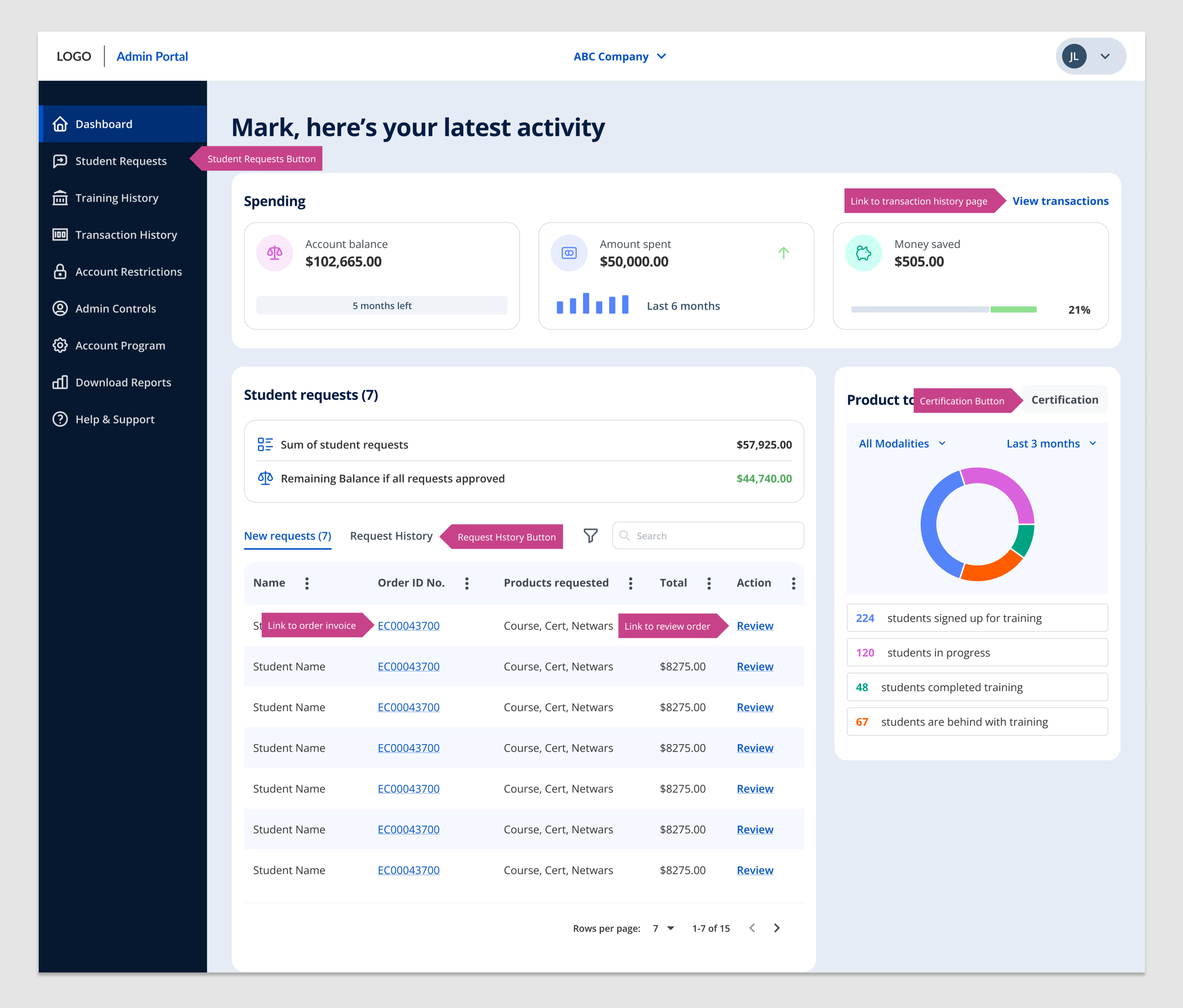
Links & Buttons:
Important because: Screen reader users can navigate by links or buttons to understand the different actions on a page, or where else they may be redirected.
- Review your design:Identify everything that is a link or button on your screen. Links take the user to a new location, for example, a new web page. Buttons change a state on the existing page.
- Write Link Text:For links, ensure that the link text provides a clear description of the link's destination or purpose. Use descriptive and contextual link text that conveys the purpose of the link when read out of context.
- Use Button Labels:For buttons, use clear labels that accurately describe the action associated with the button. The label should indicate what will happen when the button is clicked. Avoid using non-specific labels like "Submit" or "OK." Instead, use labels that describe the specific action or result, such as "Proceed to Checkout”.
Tip: remember that links are used for navigation, and buttons are used for changes in functionality.
Designing for assistive technologies is crucial for creating inclusive and accessible digital experiences. In this step-by-step guide, we have explored key practices and tips to ensure that design assets are fully accessible. By using the Figma A11Y toolkit, we can annotate screens and define expected behaviours for screen readers, providing a consistent experience for visually impaired users. To make this a success ensure your team collaborates closely, and aim to test with a screen reader early and often throughout the development process to catch and fix issues early.
If you need help with ensuring you are considering accessibility and would like to follow this approach, please get in touch and the SF team will be on hand to help with your project.
About
the author


