Insights
Many of these lessons were learnt working with prestigious schools like Clifton College.
Independent schools are navigating a period of significant change. Rising fees, shifting parental expectations, and the removal of VAT exemptions are all driving families to reassess the value of private education. Focusing on a clear, user–friendly digital presence is now more important than ever.
At Spinning Fox, we help independent schools respond to these pressures with clarity, confidence, and evidence–based design. By combining deep user research, behavioural insights, and UX best practices, we create streamlined, user–focused digital experiences that simplify the admissions process and highlight each school's unique strengths, enabling schools to stand out in a competitive market and drive meaningful growth.
Insight #1
School websites often evolve over time with content added by multiple departments without a central content strategy. This results in overly complex menus, content–heavy pages, and unclear navigational structures. For parents (especially those new to private schooling) this can feel overwhelming and disorienting. They often don't know where to start or how to get back to where they were when using the website, which leads to frustration and missed information.
We begin with a full content and user experience audit. This includes identifying the most and least visited pages, analysing key user flows, and identifying potential friction points. From there, we restructure the site architecture to support user needs, streamlining the content hierarchy so it is intuitive and goal–oriented. We apply UX best practices, prioritising core journeys that drive conversion in the primary navigation. For example "Visit Us" or "Register an Interest".
A clear, consistent website layout and intuitive navigation reduces cognitive load and enhances usability. This improves parent satisfaction, increases engagement, and ultimately leads to an increase in school enquiries by making it easy for parents to find what matters most and take their next steps confidently.
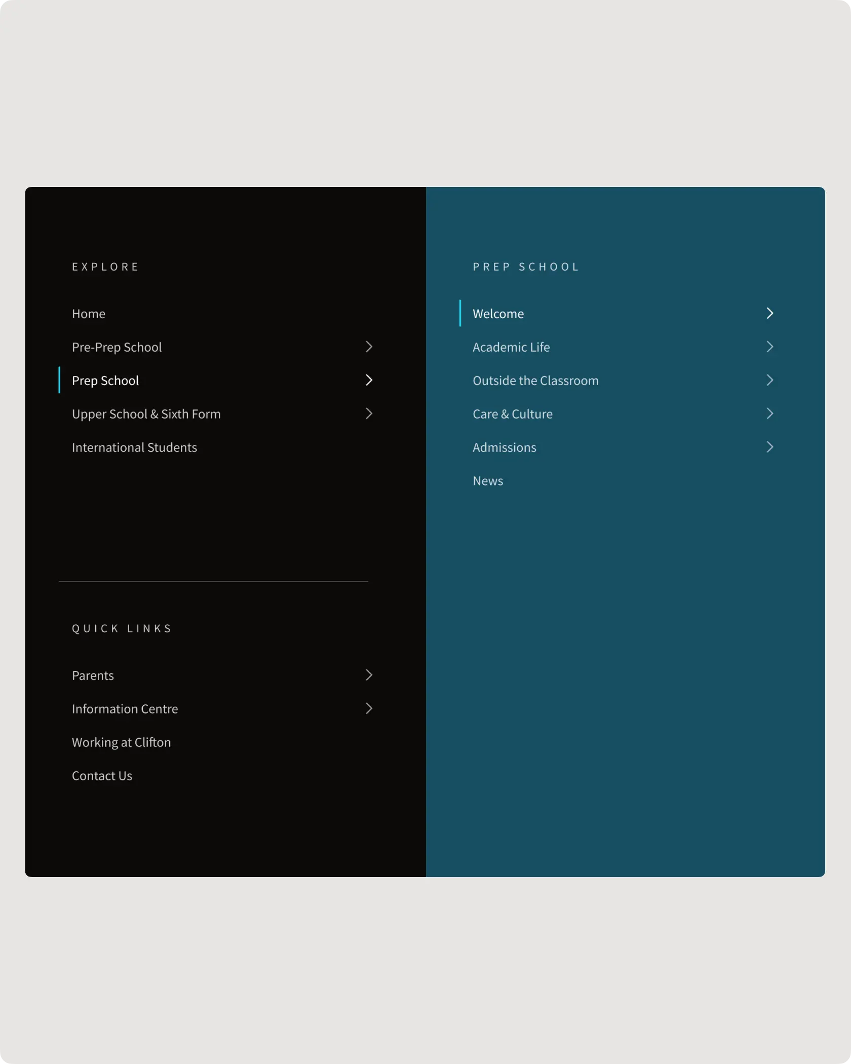
A simplified navigation focused on real user journeys.
Insight #2
Many school websites are built on generic templates that look professional but don't reflect how parents actually make decisions. These templates tend to present all content equally, without prioritising the emotional and practical steps parents go through when researching schools. The result is a flat experience that doesn't build trust or support users through their journey.
We conduct in–depth research with prospective and current parents to map the entire end–to–end admissions journey. This starts at initial awareness, to research, comparison, visiting the school, and registering an interest. We find this journey is often non–linear and is emotionally charged, with parents returning to the site multiple times with different questions at each stage.
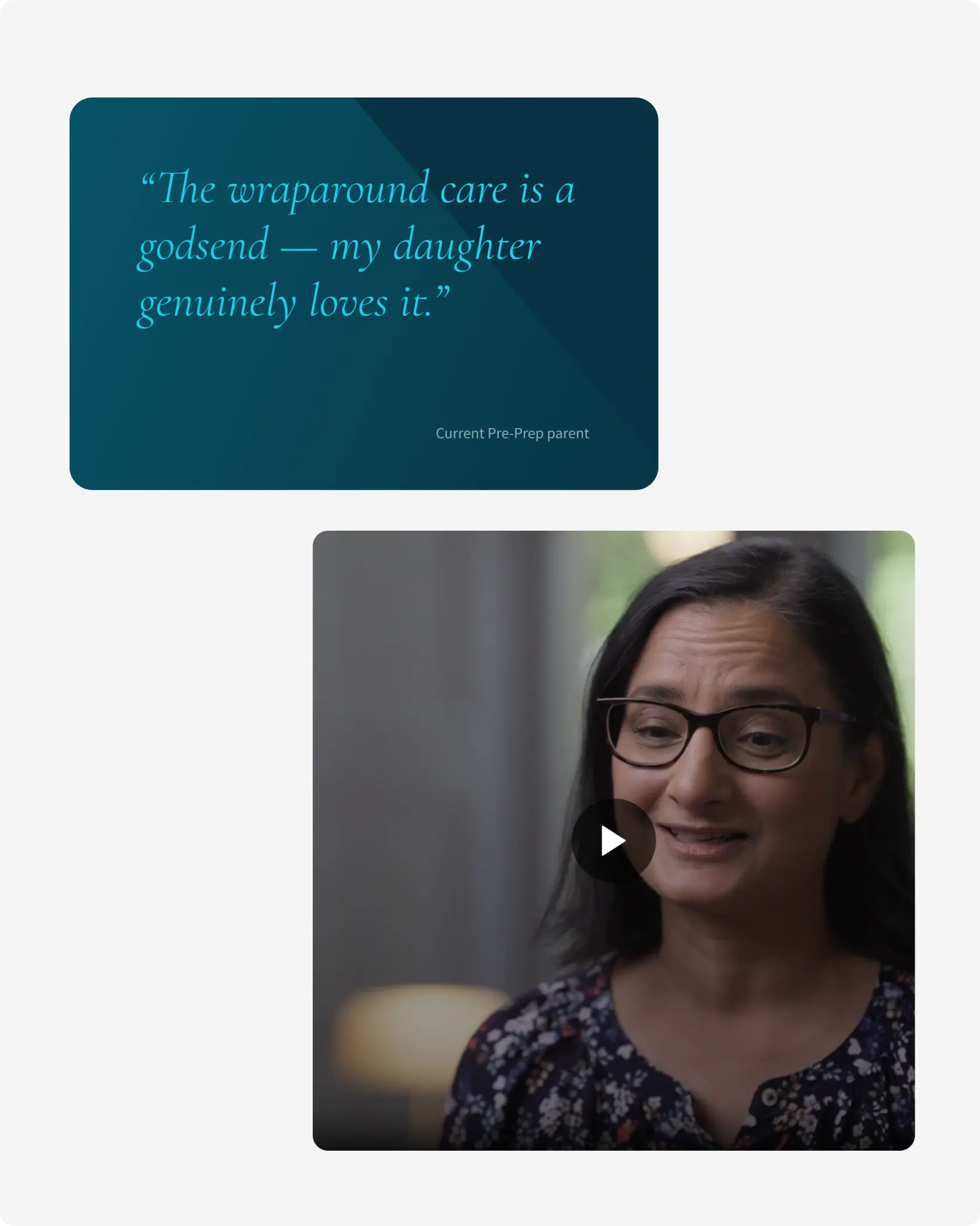
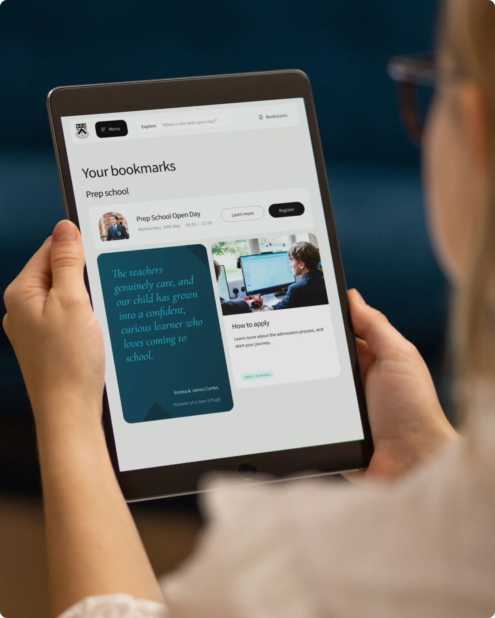
Using these insights, we design experiences that anticipate user needs. The content is tailored to specific stages of the journey, using clear calls–to–action, and incorporating trust–building elements like testimonials, a break down of the admissions journey, and a day–in–the–life style content to highlight the school's offering.
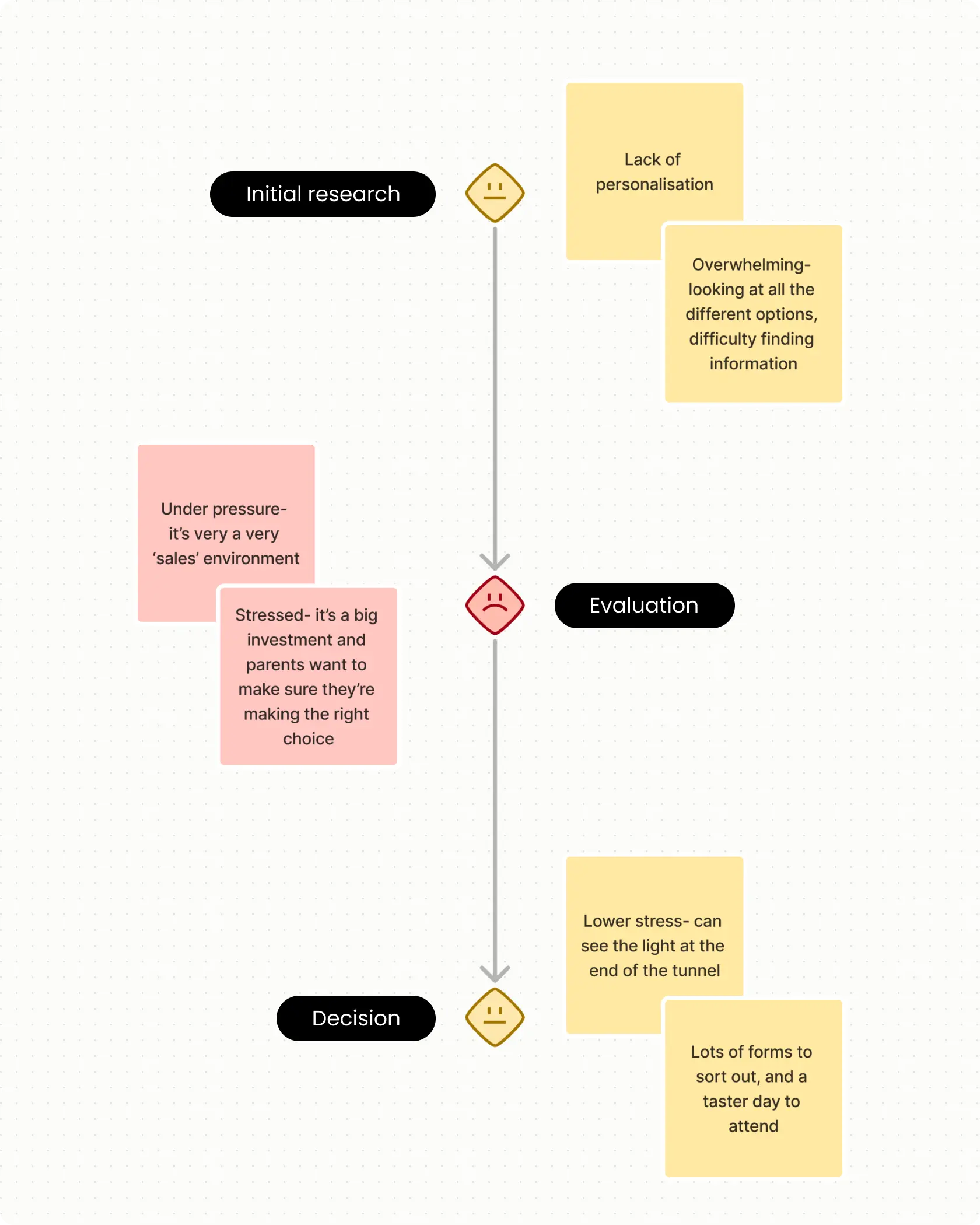
Our number one priority is always understanding the user.
Insight #3
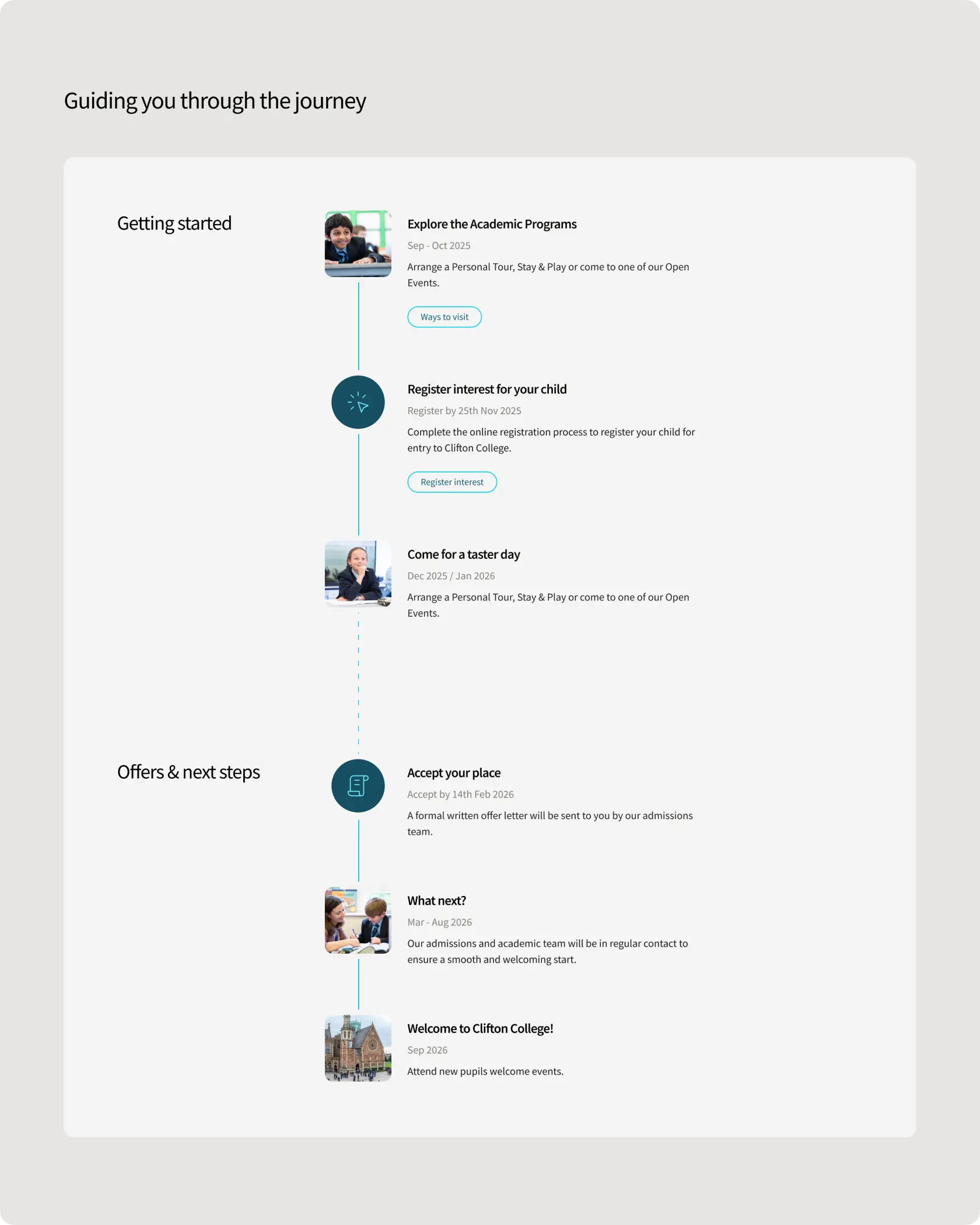
While many school websites lead with values, vision, and beautiful photography, they often fail to answer practical questions clearly. Based on our research, parents aim to find the information they are looking for as quickly and efficiently as possible. For example information around fees, scholarships, deadlines and how the admissions process works. When this information is buried or unclear, it hinders their decision–making process.
We help re–write and restructure content to balance emotional storytelling with functional clarity. Using clear headings, bite–sized sections, and collapsible FAQs, we make sure key information is accessible at a glance, and deeper detail is there where needed.
Busy parents can self–serve using the website without having to email or call, building trust and speeding up their decision–making and reducing pressure on in–house support teams.
Matching storytelling with practicalities.
Insight #4
Many schools use generic phrases such as "academic excellence" or "supportive community", making it difficult for parents to distinguish one school from another. Unique strengths such as specialist programmes, scholarships, or boarding facilities are often underrepresented or difficult to find.
We work with schools to identify and highlight their unique selling points. Through targeted content strategies, including testimonials, videos, and visual storytelling, we bring these differentiators to the forefront of the user journey.
Highlighting distinctive features helps parents quickly understand the school's unique value, enhancing emotional connection and improving competitive positioning.
The upfront research we do with parents always reveals great USP's.
Insight #5
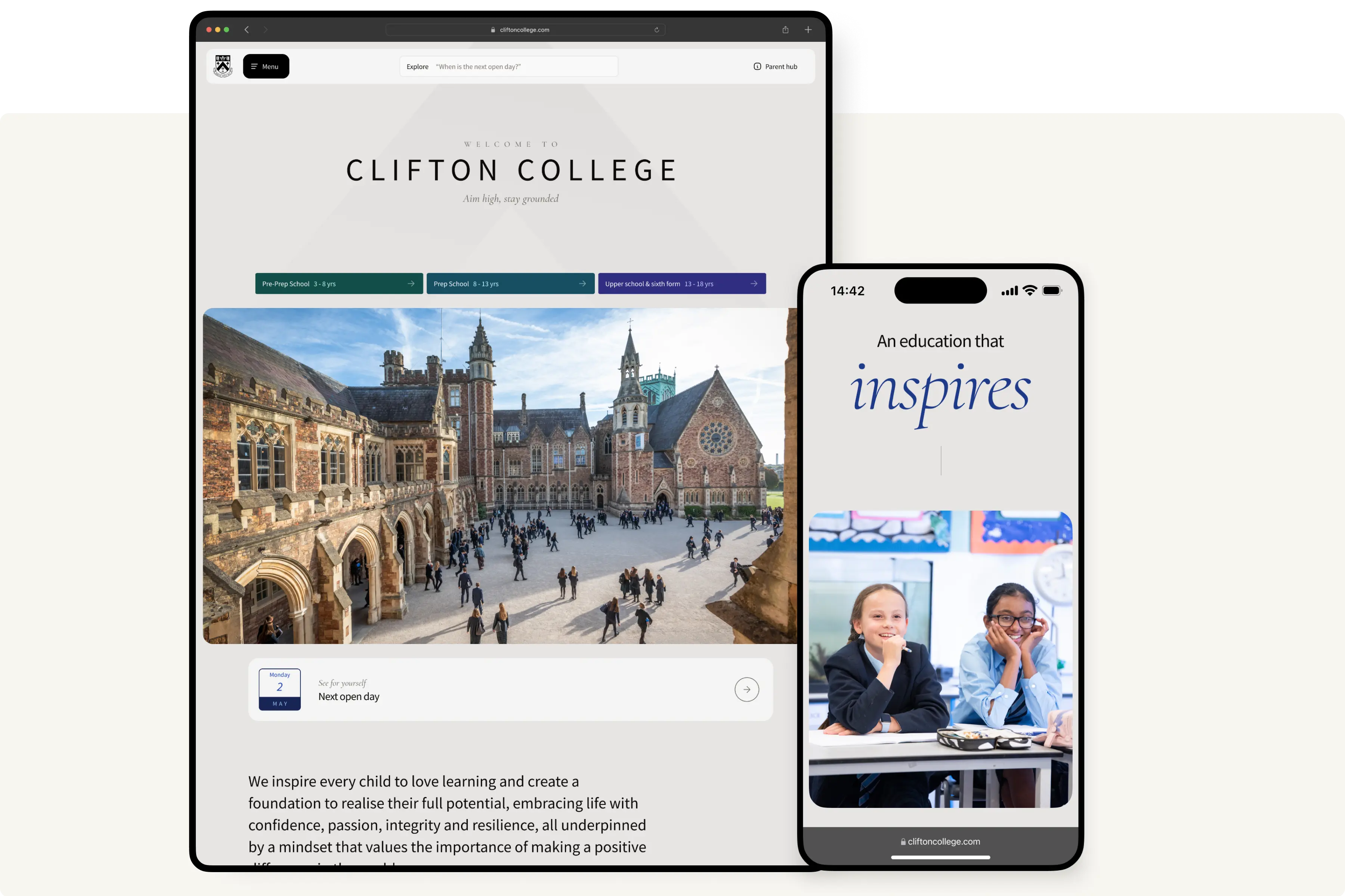
User expectations for websites have evolved, and outdated designs can create a negative impression about a school's innovation and quality. Slow load times, cluttered layouts, and websites that don't adapt properly on mobile undermine user confidence. It is important to show how the school embraces innovation and helps to prepare students for the future.
We stay ahead of emerging trends and help schools implement forward–thinking UX strategies, from inclusive design practices and emerging technologies, to scalable design systems that future–proof the site for evolving needs.
Schools that embrace innovation stay competitive and are better positioned to evolve with changing expectations, without needing costly rebuilds every few years.
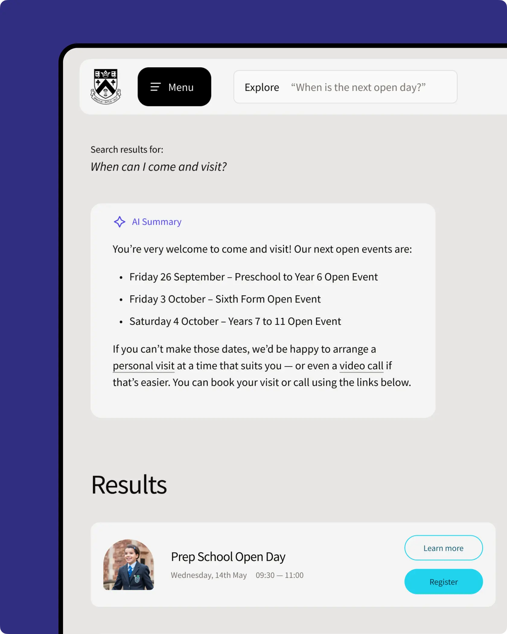
An example of how we carefully integrated AI features for Clifton College.
Insight #6
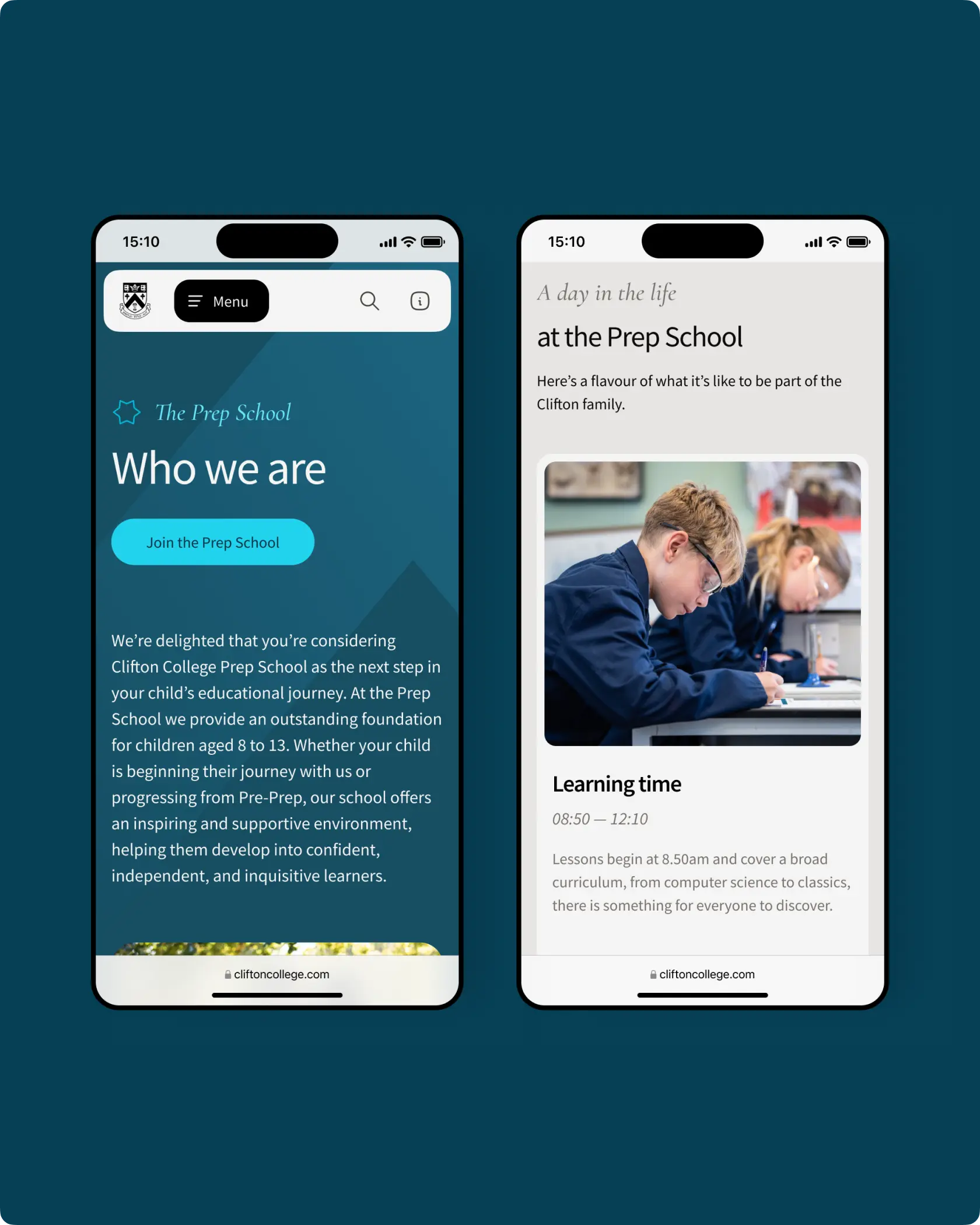
Our research shows that the majority of parents access school websites via mobile devices, yet many sites remain optimised for desktop use. This results in difficult navigation, unreadable content, and complicated forms on smaller screens.
We ensure our designs are fully responsive for mobile, and validate through usability through testing on real devices. We ensure buttons, menus, and forms are easy to interact with, and content is streamlined for clarity on smaller screens.
A mobile optimised site increases user engagement and conversion rates by enabling parents to complete critical actions like form submissions or open day bookings effortlessly.
High quality mobile experiences are vital for busy parents.
Insight #7
Many schools launch websites without usability testing or robust analytics, missing insights into user behaviour and areas where the site fails to meet user needs. This leads to costly fixes, and a lack of clarity as to how the website can be enhanced over time.
We conduct usability testing with real website users during development to identify and resolve issues early. After launch we implement comprehensive analytics, for example heat maps and user tracking, to help schools with continuous improvement of their digital offering.
Ongoing measurement and testing enables schools to refine their digital presence based on real user data, improving engagement, reducing drop–offs, and supporting strategic growth.
Usability testing is vitally important for a quality end product.
In a crowded, fast–changing market, a school's website should be its strongest admissions tool, not a barrier. At Spinning Fox, we transform complex, outdated sites into clear, compelling, and conversion–focused experiences that guide parents from first visit through to registration. The result? A digital presence that stands out, builds trust, and drives growth.
+44 (0) 7862 024 527

"Everyone on the Spinning Fox team is truly dedicated to their craft and passionate about user-centric design. They're an absolute pleasure to work with."
SANS Institute

