Insights
The health and wellness market is growing rapidly, creating both opportunity and pressure for businesses. It is now valued at around £171 billion (7.3% of UK GDP), making the UK the world's fastest-growing wellness market since 2019*. Within this, the corporate wellness sector continues to expand, worth roughly £2.1-£2.2 billion today and projected to reach £2.9-£3.5 billion by 2029-2033**.
As competition intensifies, user experience (UX) has become a key differentiator. Users expect personalised, seamless journeys, while employers require measurable outcomes. Yet many products still face recurring UX issues that limit engagement and trust.
At Spinning Fox, we help organisations overcome these challenges by improving product clarity, usability and impact. Based on our work, here are the eight UX barriers we see most often, and how to address them.
Sources: * Global Wellness Institute ** IMARC Group
Insight #1
Health and wellness apps frequently deliver sensitive recommendations, personal insights or AI-assisted guidance. Users are increasingly cautious about where data goes, how insights are generated and whether the system understands their needs. Anything unclear or overly generic can quickly erode trust.
We design transparent, trust-first experiences. This means explaining why recommendations appear, showing how data is used in simple language, and setting clear boundaries around what the app can and cannot do. Where sensitive content is involved, we ensure safe, evidence-aligned presentation.
Trustworthy experiences lead to deeper engagement, richer data, fewer misunderstandings and far stronger credibility with both consumers and organisational buyers.
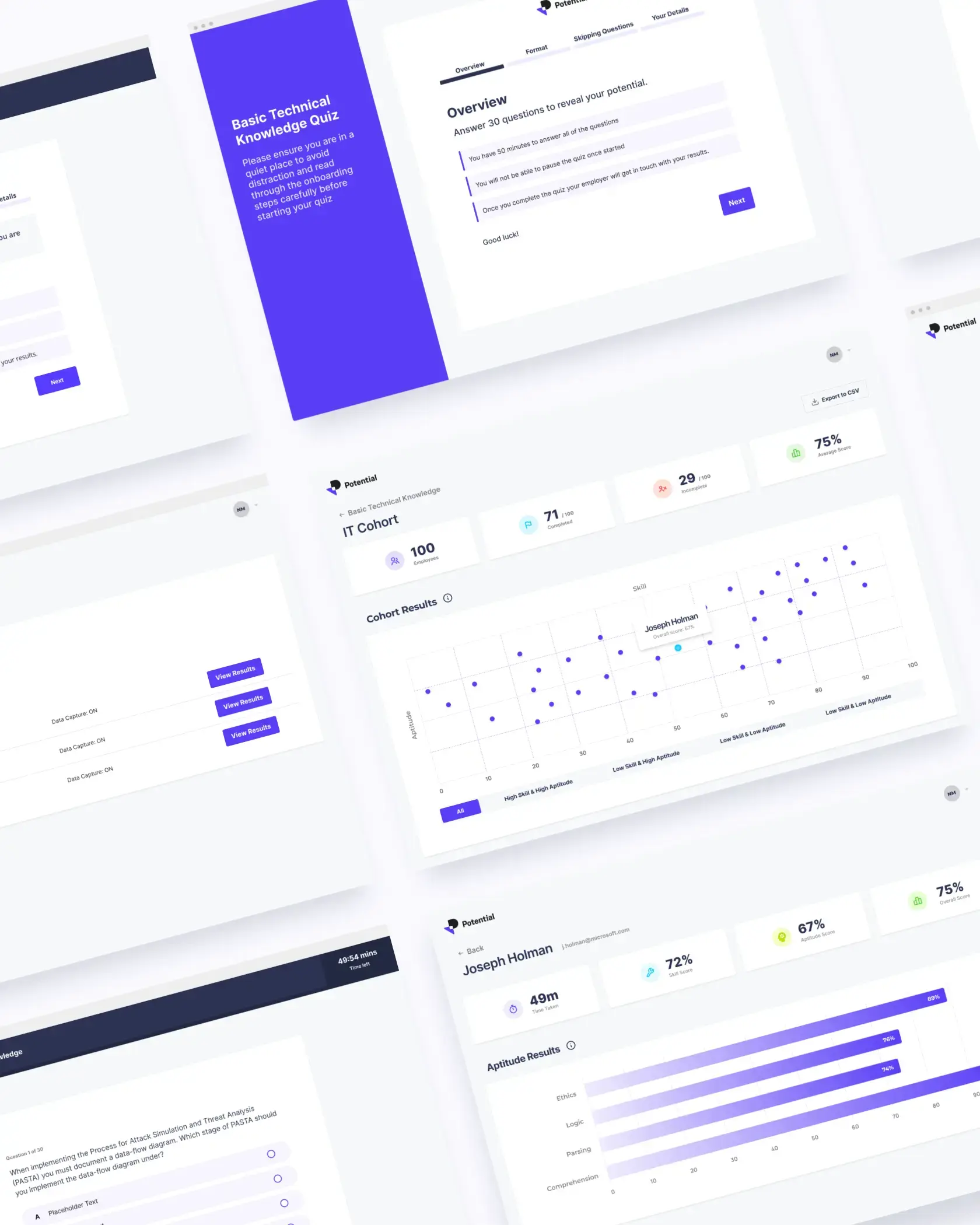
Example
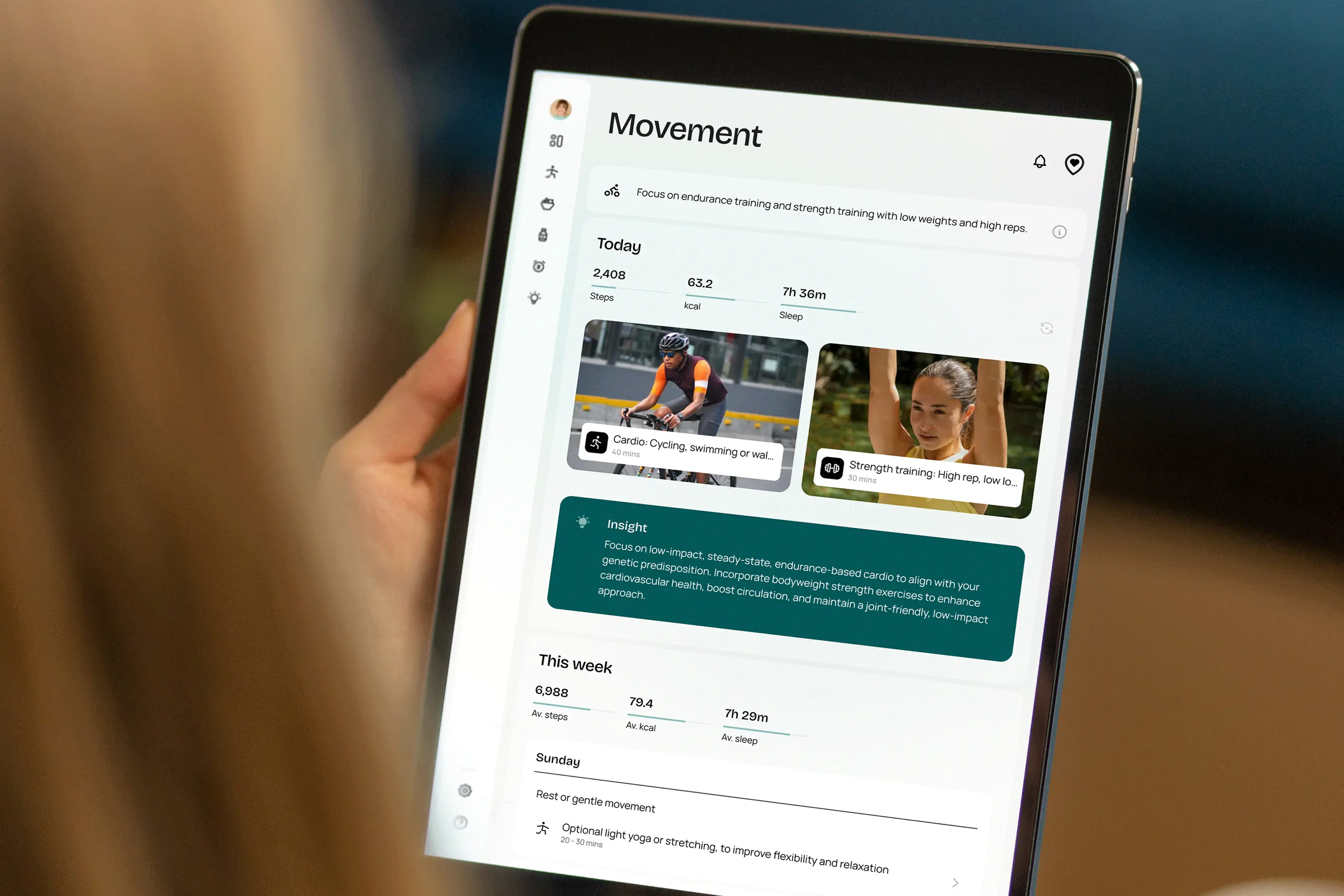
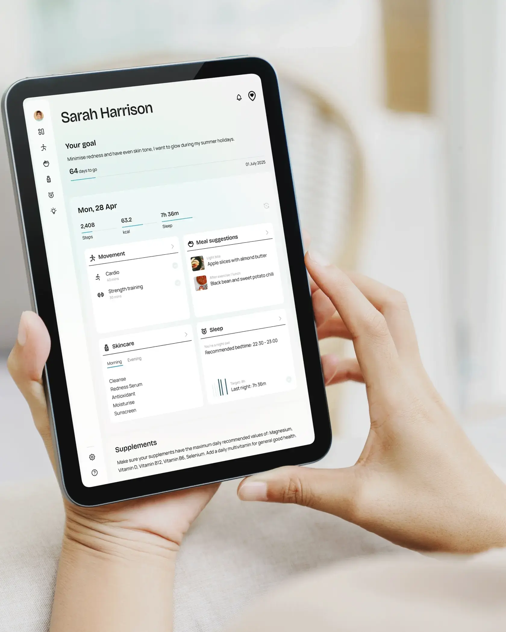
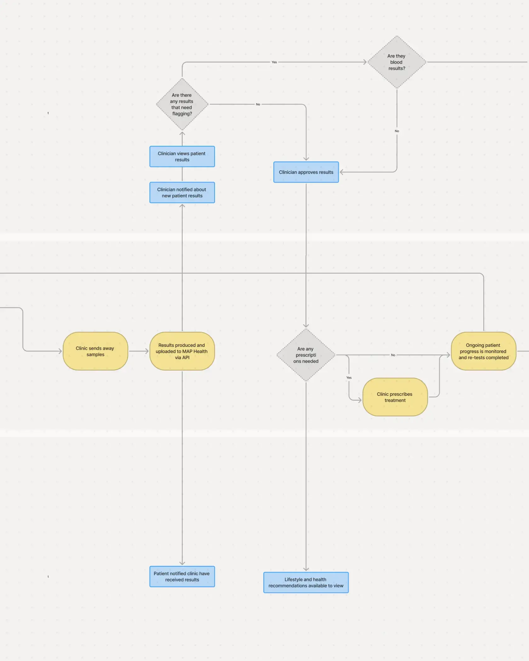
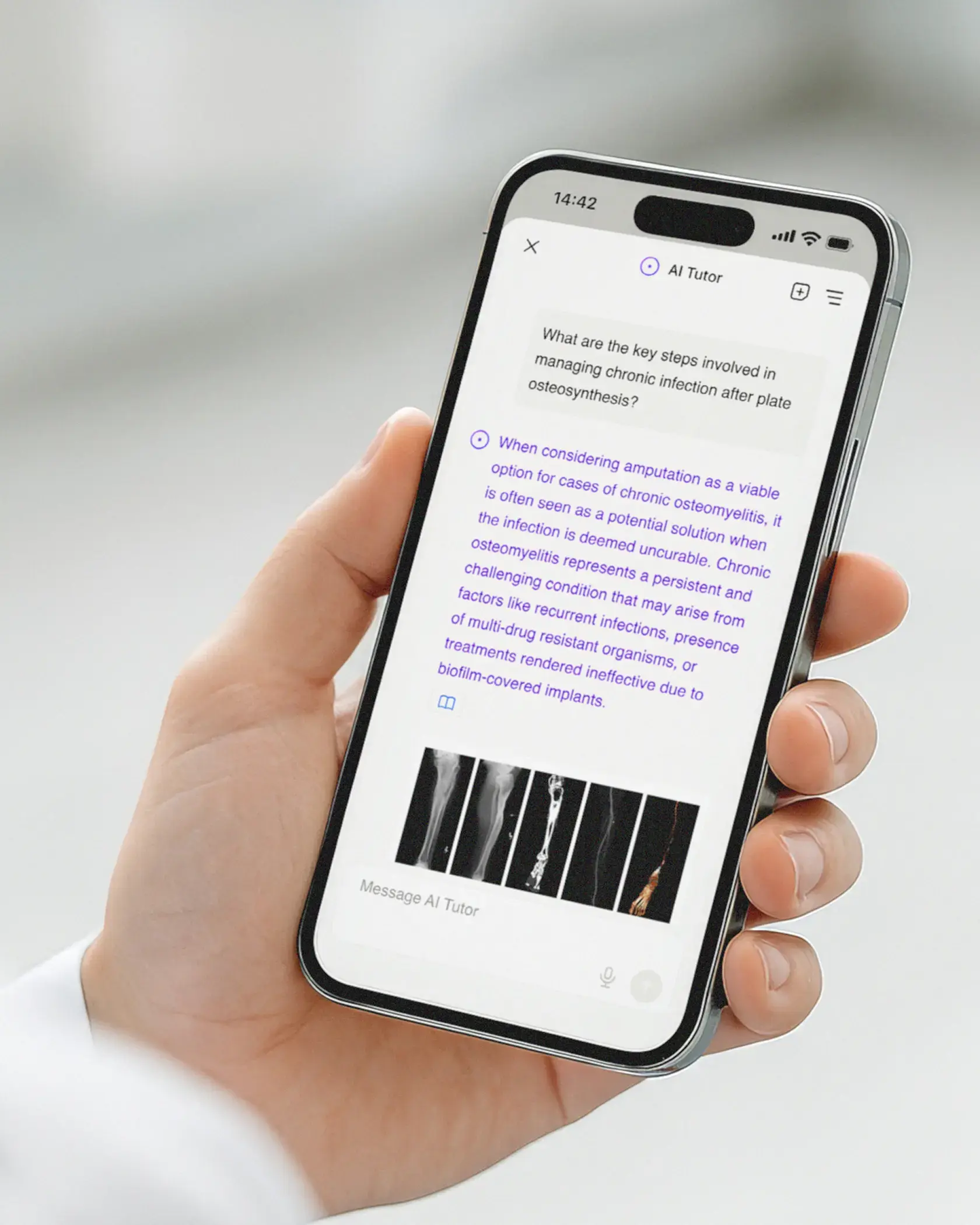
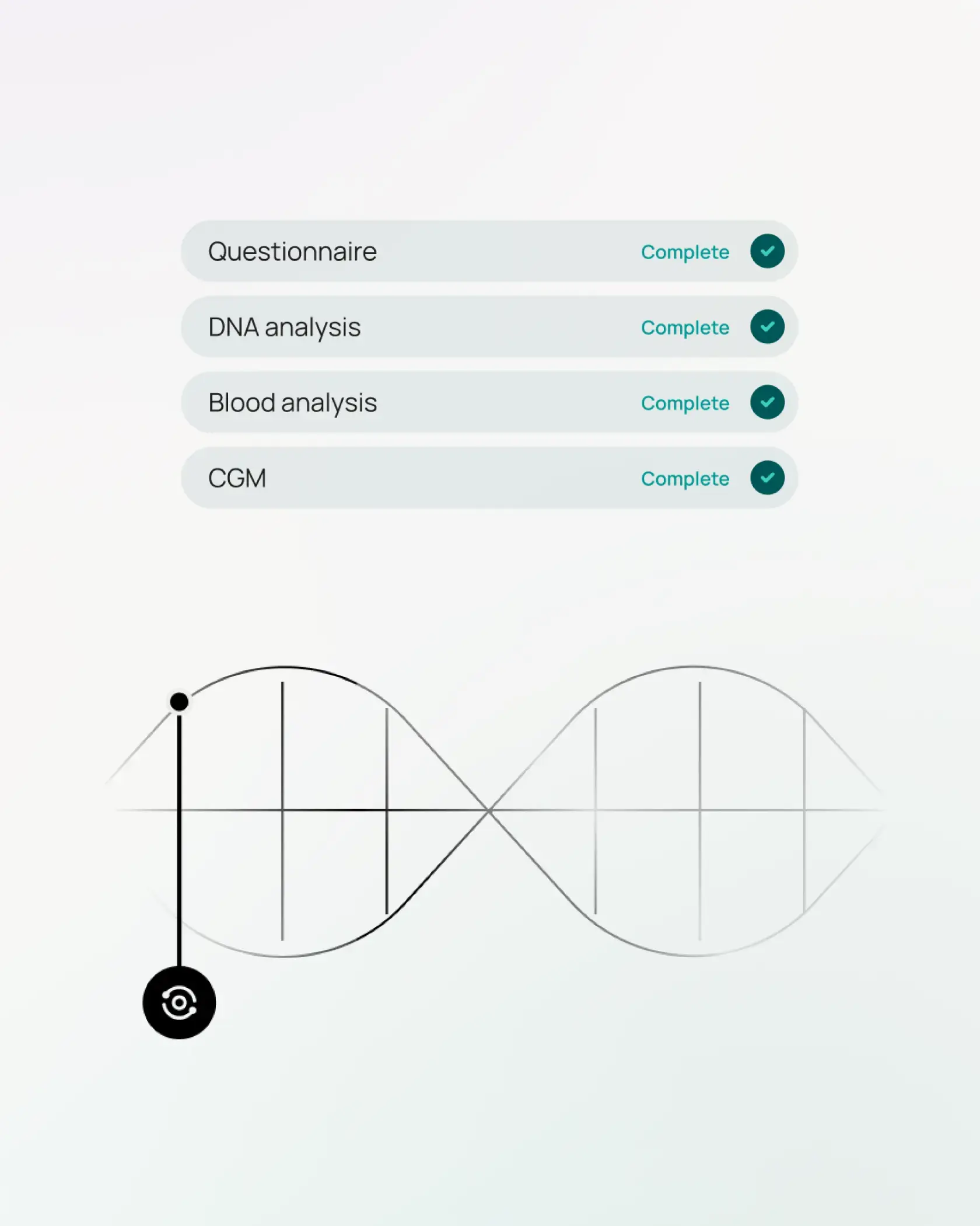
We worked with MAP Health, who needed to turn sensitive, multi-source health data, from DNA to bloodwork and glucose monitoring into personalised wellness plans users could trust. Patients felt overwhelmed by raw data, and clinicians needed confidence in how AI-generated insights were produced.
Through understanding the audience, we designed the experience to make recommendations transparent and human-centred. We created a clear onboarding questionnaire, intuitive visual explanations that broke down complex results, and plain-language reasoning showing how each recommendation was generated. Clinician-facing flows were designed to support, not replace, expert judgement.
Moderated user testing confirmed that the new experience felt understandable, safe and credible.
The validated prototype now helps MAP Health secure clinic partnerships and investor momentum:
100% of clinics adopted the platform after a demo
2.5x patient sign-ups beyond initial projections
By making AI guidance transparent and grounded in clear UX, MAP Health turned complex data into insights users trust.
Insight #2
Many products serve more than one audience at once. A single platform may need to support consumers, practitioners, coaches, administrators, employers or partner organisations. Without strategic alignment, the experience becomes fragmented, creating confusion, duplicated components and inconsistent flows.
We create a unified product framework that clarifies how each persona interacts with the system. This includes multi-persona journey maps, coherent information architecture, role-based interfaces and design systems that maintain consistency across all touchpoints.
Clear journeys reduce friction, lower support burden and help teams build scalable products that can grow into new features, markets or business models without accumulating UX debt.
Insight #3
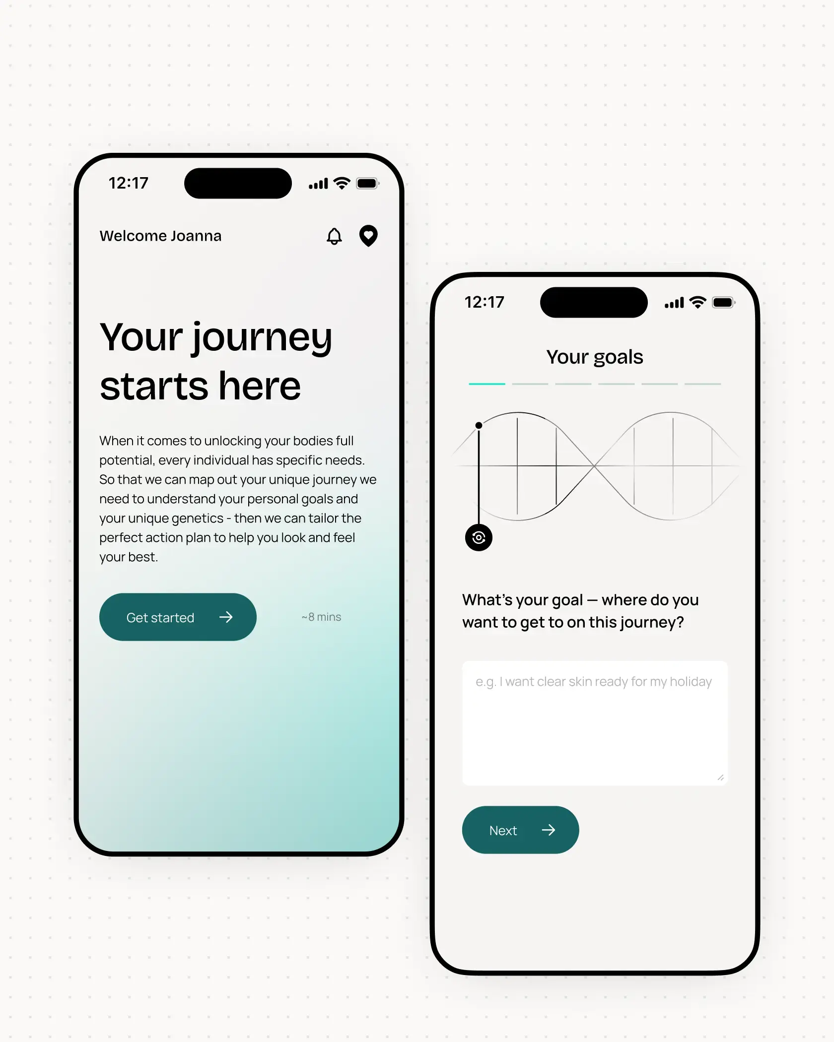
Many health and wellbeing products see strong initial sign ups followed by a sharp decline in active use. Users often explore enthusiastically at the start but lose momentum when the product does not quickly demonstrate its personal relevance or fit naturally into everyday routines.
We design onboarding as a structured behavioural journey that builds confidence and early success. This includes personalised starting points, clear guidance on what to do first, achievable early wins and carefully sequenced introductions to more advanced features. Multi-channel nudges support habit formation, keeping users engaged after initial curiosity fades.
When users understand how the product supports their goals within the first few days, long-term engagement increases significantly. This leads to better outcomes, stronger retention and a clearer value story for employers, partners or investors.

Example
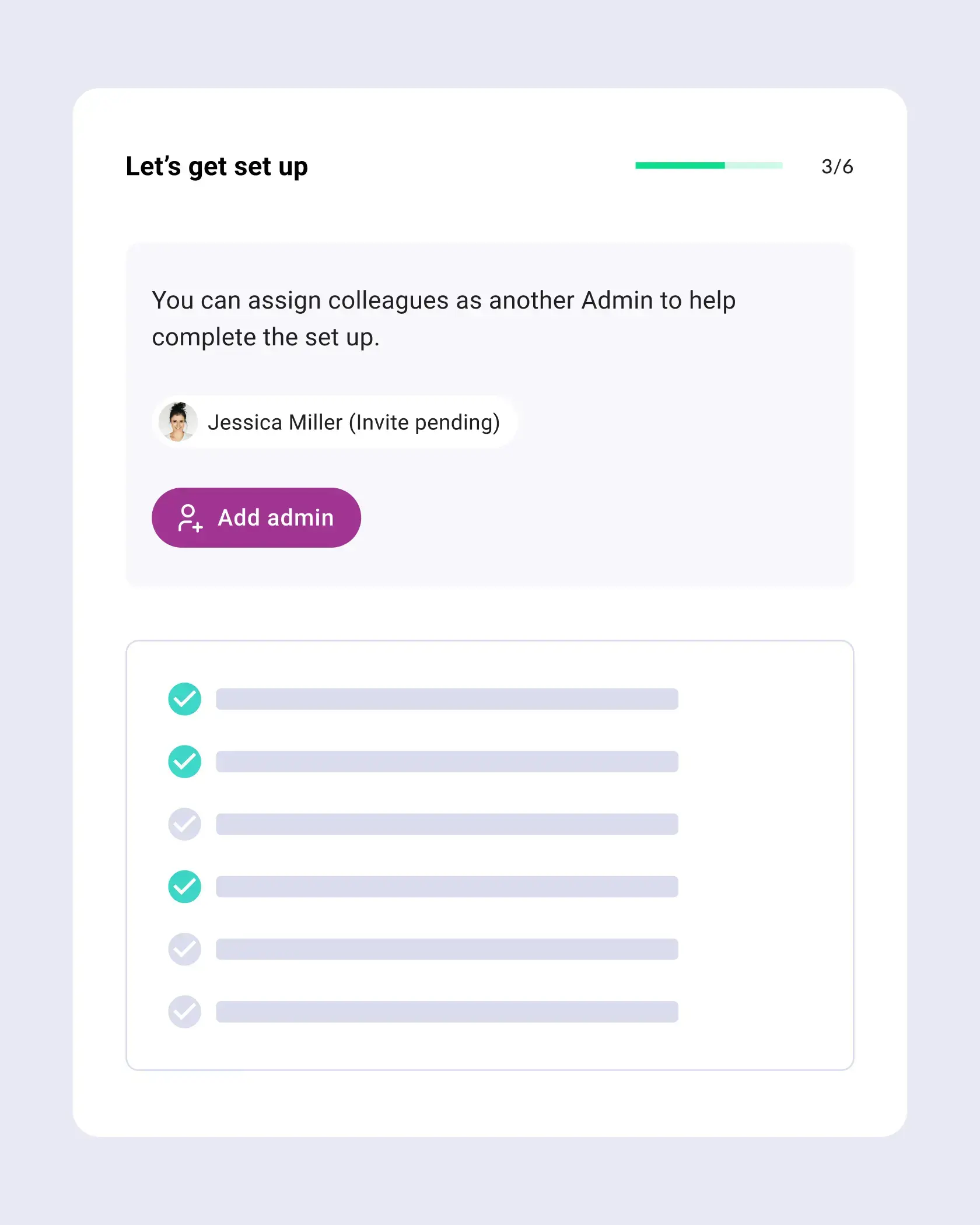
We worked with an early years education platform that was seeing strong sign-ups but stalled onboarding. Administrators were typically responsible for setup, yet they often lacked information that only teachers had. This meant they had to pause, chase details, and return later, causing delays, drop-offs, and lost momentum before the product could show its value.
Through a UX audit, user interviews, and internal feedback, we identified where admins were getting stuck. We then introduced a flexible, non-linear onboarding checklist that users could complete in any order and assign tasks to other colleagues. This allowed admins to make progress even without all the answers, while keeping the process intuitive and collaborative. We refined key flows, preserving familiarity while removing friction. Moderated testing confirmed the improvements worked.
The new experience simplified setup and boosted confidence. Since launch, 1,398 new organisations have successfully onboarded, with zero support tickets for the new process, a powerful signal of clarity.
Key results:
92.7% checklist completion rate
83% found the new design intuitive
By reducing blockers and supporting early wins, the platform now sees faster activation, smoother adoption, and stronger long-term value.
Insight #4
Many apps promise improved wellbeing and healthier habits, but rely on generic content or one-size-fits-all nudges. Without personalisation, realistic goals or timely reminders, users struggle to maintain momentum.
We apply behavioural science to create personalised, adaptive pathways. This includes goals tailored to the user's stage of change, meaningful progress feedback, intrinsic and extrinsic motivation loops, and well-timed prompts that support real habit formation.
Effective behaviour change improves retention, user satisfaction and measurable outcomes. It also strengthens a product's long-term value proposition for employers and strategic partners.
Insight #5
Whether aimed at consumers tracking progress or organisations reviewing wellbeing metrics, dashboards often present too much data with too little explanation. Metrics appear without context, charts feel dense and the path to meaningful insight is unclear.
We redesign dashboards to highlight the most useful, actionable information. This includes clear baselines, trend lines, cohort insights, and narrative summaries that explain what the data actually means and recommended next steps. Visual hierarchy ensures the most important patterns stand out first.
Data becomes a compelling part of the product's value. Consumers gain clarity and motivation, while organisations see evidence of progress, making renewals and investment decisions easier.
Insight #6
Many health and wellbeing tools require users to complete assessments, sync devices, answer detailed questionnaires or navigate multi step onboarding flows. If these workflows feel confusing or heavy, users abandon the process and never return.
We simplify workflows with guided steps, contextual explanations, progressive disclosure and clear micro-interactions. Smart defaults reduce effort, while friendly error handling helps users recover from mistakes without frustration.
Smooth early experiences significantly increase activation, reduce support tickets and create a strong foundation for ongoing engagement.
Insight #7
As teams grow and new features are added, inconsistencies quickly emerge. Different parts of the product use different patterns, content styles or interaction models. Over time, this creates friction and makes the product harder to scale and maintain.
We align teams around a shared design system, consistent information architecture and clear UX governance. This ensures that every new feature reinforces the overall product experience rather than working against it.
Consistency builds trust, reduces cognitive load and strengthens the brand. It also accelerates development because teams work from the same foundations.
Insight #8
Whether selling to consumers, employers, clinics or partners, products increasingly need to show measurable results. But without UX designed to capture and communicate outcomes, the narrative becomes vague and unconvincing.
We build outcome measurement into the UX itself. This includes clear goal setting, repeatable assessments, longitudinal data capture and dashboards that translate platform usage and engagement into meaningful impact.
Having evidence is essential for renewals, enterprise sales, credibility with users, and strategic growth. UX designed around outcomes makes the value of the product visible and defensible.
The health and wellbeing space is expanding rapidly, but user expectations are rising even faster. If you have a health or wellness app, UX maturity now determines whether your product thrives or disappears into a crowded market.
At Spinning Fox, we help product teams: simplify complex user journeys so they feel intuitive; build trust around guidance, recommendations and data; design dashboards that lead to real understanding; embed behaviour change that delivers lasting outcomes, and; scale products without losing coherence or quality.
If you want to elevate engagement, strengthen your product's value story and deliver experiences users love, we can help you design your next phase of growth.
+44 (0) 7862 024 527

"Everyone on the Spinning Fox team is truly dedicated to their craft and passionate about user-centric design. They're an absolute pleasure to work with."
SANS Institute

